|

|
Lancer
|
|
Oregon Coast, USA! or Bohol, Philippines!
Apr 1999
time: 05:18
|
|
How about this Dan, writ large...
YO. You're here. Apolyton Civ site. Don't spit on the floors.
(Just kidding, I think it's great the way it is)
|
|
| |
|
|
|
Adm.Naismith
|
 |
Milano - Italy
Oct 1999
time: 06:18
|
|
quote:
Originally posted by Snapcase
What are you trying to achieve with this layout? Why were the design choices made the way they were?
<SNIP>
I give it a C+; it's not exceptionally clearer than the last page and it's pretty Uugly compared to most sites. |
Snapcase, I liked your line of thinking: define the goal, analyze the site part, spotlight some style hiccup... 
I'm not a professional webmaster, but I was project manager in a project about redesigning a corporate site. Some bit of good site design concept are still resting somewhere in my mostly empty head 
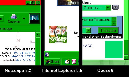
Sorry DanQ, I don't want to insult any hard job you did to improve the site, but the only improvement I've found is about a quick load time. You really should address some of the Snapcase points, at least to let us better understand your design plan. I must add I have some compatibility trouble using Netscape 6.2 on a Win XP notebook, 1024*768 resolution (but I have worse trouble with this form to write message  ). ).
It's pretty difficult to me to rate with letters (during my loong past school time in Italy I was used to a rating system based on a decimal method (1 the worst, ten the best) or "evaluations by words" like "good", "excellent", and so on.
My only knowledge of the method link to an old Science Fiction novel I red, titled "E for Effort". 
Don't worry, I rated the site a "C", also because you don't use "E" as an allowed option. 
|
|
| |
|
|
|
DanQ

|
|
Emperor of Apolyton, Ruler of the Here and Now
|
 |
Ontario, Canada
Aug 1998
time: 00:18
|
|
Typing oversight on my part, re: link from "Alternate" layout back to "Standard", Martin. This has been corrected. In Netscape 4.x+ (and earlier versions I am assuming as well), the bottom portion now appears on both the "Standard" and "Alternate" layouts. There was a coding error and I thank you for pointing it out.
Adm.Naismith: you mentioned you were having problems on your WinXP notebook machine with Netscape 6.2 at 1024x768 resolution. Are you talking about a "horizontal" scroll or..? Is this version of Netscape specific for XP (like some other companies are doing with their products)? What is your monitor size? Please elaborate.
Also, regarding 'what I was going for' in this design was simplicity -- for those who found the most previous version too cluttered. Second, the reason for the table border colour around the news centre was for it to jump out from the rest of the page while still being apart of it, that is as a different shade of blue as opposed to another colour altogether. As for the lack of <I>extensive</I> use of images, again, this was a combination of my simplicity plan as well as load time concerns. Even as broadband access continues to penetrate more areas of the globe, a great majority are still on dial-up and even those on broadband might like to see a page that is not graphics intensive and eating up their allotted bandwidth. Moreover, it was to show that a page does not need to rely heavily on graphics to be, for a lack of a better word at the moment, functional.
But, again, if you prefer the old layout, you are welcome to it. You can switch back and forth between the two regularly or bookmark one and ignore the other from here on in. The choice is yours...
----------------
Dan; Apolyton CS
P.S. If I have not addressed your issue(s) yet, rest assured that I am not ignoring your suggestions/concerns etc. I will address them as soon as possible.
|
|
| |
|
| |
|
| |
|
| |
|
| |
|
| |
|
|
|
DanQ
|
|
Emperor of Apolyton, Ruler of the Here and Now
|
|
Ontario, Canada
Aug 1998
time: 00:18
|
|
A minor update to the new, now so-called <I>standard</I> layout to the homepage today:
* Merged 'Affilate Sites' and 'Hosted Site' bars into one 'Affiliate / Hosted Site Bar', increasing font size in all site listings there and subsequently each site's full title is now listed (save on).
And now, to address some more of your comments/suggestions etc.
re: "little green box"
Although not necessarily as buggy as IE 6.x reportedly is (although I personally have had no problems), Netscape 6.x has been cited as not being as good a browser as 4.x, so I still use Netscape 4.78. As a result, I was not aware of this box's existence under the latest version of Netscape until now. It does not appear in IE 6.x or Netscape 4.x as the advertisement should be hidden (due to our being hosted on a non-corporate server at present). Either ignore the box or if it really annoys you use IE 6.x/Netscape 4.x is the best I can offer you. Write to Netscape and tell them to tell their Navigator coders to smarten up. 
While we're on this subject still, is anybody running Netscape 6.0 or 6.1? If so, can you report in as to whether you can see this box as well? I suspect you can but I am just curious.
re: listing of site sections (Lockstep)
The forums are apart of the "Miscellaneous" section, while "About Apolyton" is a primary section unto itself. The latter is not apart of the former because they are distinctly separate things.
re: resolution compatability
Thanks for the report, Zealot!  To Grrr: what browser/version are you using and what is your monitor size? I take it you have the browser window maximized on your screen? To Grrr: what browser/version are you using and what is your monitor size? I take it you have the browser window maximized on your screen?
re: people's page preferences (Lancer)
I do recognize what you are saying and certainly past history in mainpage updates is consist with your observations. As with previous mainpage changes, what is posted initially has not been what was eventually settled upon. I would say that at the moment, the new homepage layout -- "v3.0" when launched -- is now at about a "v3.2".
-----------------
Dan; Apolyton CS
P.S. Snapcase's post with his comments on the new layout is lengthy, but yes a response to them are shortly forthcoming.
|
|
| |
|
|
|
DanQ
|
|
Emperor of Apolyton, Ruler of the Here and Now
|
|
Ontario, Canada
Aug 1998
time: 00:18
|
|
<I>What are you trying to achieve with this layout? Why were the design choices made the way they were?</I>
I have already addressed the first part of this question in an additional post in this thread since you intitally asked this. The answer to the second part of your question flows from the first: the design choices that were made were done with what was set to be achieved with the new layout.
<I>What appears on the first screenful to lure in the prospecting Apolytoner? The main focus of attention seems to be the UNHCR ad in the middle of the page. That's what your eyes are drawn towards. Why is there so much white space?</I>
While I would think the Apolyton logo at the top would draw initial attention, I can see where you are coming from, re: ad. As we have said before, the non-corporate server the site is presently hosted on is a temporary albeit extended accomodation. If/when we are able to move to another gaming network, we will again be displaying commercial ads. Given that advertising is what has historically and will then once again pay for the incurred costs of the site, this quote of yours is exactly what the advertising agency, advertise and "advertisee" like to read.
<I>Should the "News headlines" bit be either outside the first screenful or fully inside it?</I>
Given that different resolutions and monitor sizes will vary what one can see in the first screenful, this is something that is by and large out of our control. Indeed, however, the headlines for the most recently released/upcoming games should appear in the first screen on most users' computers, the standards of which are more likely then not still 800x600 and a 14"/15" monitor.
If they do not for one reason or another, however, the "Current Games" menu will be.
<I>Is there enough on the first screenful to tell people what this site is and does? Sure, there's the filler text, but how many people read that first thing?</I>
If people are not familiar will the introductory paragraph and choose not to read it, that is their decision. The 'first screenful', as you put it, is to provide a general overview of the purpose of the site and is by no means intended to serve as an extended description or history analysis. That is what the "About Apolyton" section is for.
<I>Why such a variety of styles? Why the low-kerning (undoubtedly CSS, which many browsers aren't compatible with) titles on the "Current Titles" (etc.) sections? Why use underlined text at all? (I keep trying to click it!)</I>
The ability of have links that are not underlined has been so for some time, and is the method that Apolyton has used since its inception. If new visitors to the site or those who have not visited in a while are not oriented to this, they should be after a few moments on their first visit. Most popular and recent versions of browsers have supported this for a couple of years now anyway.
<I>Why do links to most sections appear twice on the page? Why do the section links on the left take up so much space? Why is Call to Power a "Current Game" while the newer Alpha Centauri is a "Classic"? Why isn't the white space below the section links filled, or unevenly filled?</I>
On first question of above block: this is not a new component of Apolyton's homepage by any means. One of the links go straight to the section, minus headlines, while the other does not for each of the titles respectively.
"" second "" "" "" "": to ensure as much browser compatability as possible, especially lower screen resolutions (e.g. 640x480).
"" third "" "" "" "": both <I>Call To Power</I> and <I>Sid Meier's Alpha Centauri</I> are now listed as classic. Remember that while they were both released in 1999, there was about a six months different between the two nonetheless.
"" fourth "" "" "" "": they are, code-wise. If they do not appear to be than it is a browser/screen resolution issue.
<I>Why the chosen design for the "News Centre"? What relevance is today's date? Why is it blue, seemingly in contrast with the Red/light blue Apolyton colours? Why use such a strange border on the news table?</I>
On first question of above block: see my answer to your first two questions.
"" second "" "" "" "": this consideration has been changed from 'today's date' to 'most recent'.
"" third "" "" "" "": I do believe I answered this previously, but I will say again: to stand out from the rest of the site. It is a different shade, not a different colour, then the others used in the scheme and is close enough in shade to compliment as opposed to compromise what was already present.
"" fourth "" "" "" "": to classify something as 'strange' is a subjective opinion and there will be no pleasing everybody.
<I>Why isn't the horizontal line, banner ad, filler text and News Centre aligned on either the left or right side, nor in fact the centre?</I>
All of these items are aligned within the cells of the tables that they reside. If you have a look at the page's code, you will see that tables are what makes up the foundation of the structure of the page.
<I>Why the horizontal line at the bottom?</I>
This was a design element in previous incarnations of the homepage layout as well. This horizontal line is used to separate the page's "footer" from the rest of the content.
<I>Why is the "Top Downloads" section much shorter than the "Top Headlines" one?</I>
Part of this is the different in alignment on the page, and part is simply the descriptions assigned to the items as were deemed appropriate. One will often be slightly larger/smaller then the other, but never too distracting.
<I>Is there any sort of thought behind the relative left/right alignments on the page?</I>
This is always a design consideration and in my opinion it has been met with a solid code base. Can you elaborate on what you are getting at?
<I>Why the aversion to using images? Doesn't a pure-text page look paltry these days?</I>
There is no 'aversion' to using images, or at the very least you can agree with me that this is not so in relation to previous incarnations of Apolyton's homepage. Again, the concept of this design was simple: introduce the visitor to all of the sections of the site, and make them accessible without diversions. Speedy loading time was also a key component of the design process, and most people from home access the Internet through dial-up connections which is from where they are apt to visit the site most often. Appropriately placed, sized and selected text can be just as if not more effective in site design than images.
<I>I give it a C+; it's not exceptionally clearer than the last page and it's pretty Uugly compared to most sites.</I>
I would disagree that it is not anymore 'exceptionally clear'. The new design is more simplistically laid out than the former, in my opinion, as I have been stating all along was the goal of this work. Again, 'ugly' is a subjective and relative term and 'most sites' can refer to anything. If you want to elaborate on the 'most sites' part, feel free to do so.
In closing let me say that I do appreciate the time you chose to consider and compose your comments/suggestions, Snapcase. It is nice to have them presented in a concise manner, save one or two, and in a civil and constructive tone of criticism. I hope I have addressed your concerns adequately, but by all means feel free to respond if you would like to follow-up one one point or another.
-------------------
Dan; Apolyton CS
|
|
| |
|
| |
|
| |
|
| |
|
|
|
Urban Ranger

|
|
Apolyton Duke of Off-Topic
|
|
The design is a mishmash of design elements and design principles that's why it confuses people.
For example, part of the page is centered while another part is flush against an invisible border. Don't do that.
The use of colour and font size is also non-coventional. You want bright colours and large size for "main feature," so to speak, which in this case seems to be the News Centre. However, you have small sized fonts and a subdued colour for it. Very strange 
Don't use underline for emphasis, underlined text are hyperlinks by convention. If you want to emphasize, use some other device, such as a brighter colour, a bigger size, italics, boldface, or some such. Just don't use underline.
Some concrete suggestions:
Top: move the Apolyton banner to the left. Move the links somewhere else.
Centre: use blue for the left-handed column. Decrease the font size for the links. Move the banner ad elsewhere, perhaps to the top. Use red for the news centre, increase the font size. Get rid of the underlines.
Bottom: Flush the ad against the invisible border line. Use blue for the hosted and affiliate site headers. Break them into two rows instead of two columns. Move the links from the top section down to here.
Copyright notice: flush it against left margin.
|
|
| |
|
|
|
DanQ
|
|
Emperor of Apolyton, Ruler of the Here and Now
|
|
Ontario, Canada
Aug 1998
time: 00:18
|
|
Urban Ranger:
First, let me take the opportunity to thank you for taking the time to respond to the new layout design and for presenting your points in a precise fashion. Feedback of this nature, both positive and constructively negative, is important!
<I>The design is a mishmash of design elements and design principles that's why it confuses people.</I>
It is unconventional, yes, but that was the idea. I respect your opinion, as always, however, I disagree that with the description "mishmash" but rather have taken existing design elements/principles and combined them in a functional form.
<I>For example, part of the page is centered while another part is flush against an invisible border. Don't do that.</I>
As with any layout, such considerations are these are subjective and in recognizing that I realize that some people are not going to like it. However, saying "don't do that" implies that it is wrong when it is rather simply a different manner about going about things.
<I>The use of colour and font size is also non-coventional. You want bright colours and large size for "main feature," so to speak, which in this case seems to be the News Centre. However, you have small sized fonts and a subdued colour for it. Very strange.</I>
Again, non-conventional but functional was the concept behind this. The reason "small" fonts have been used within the News Centre is because there is a fair amount of information to convey but in a short amount of space. One could make the same argument for the 'alternate' (previous 'standard') layout. That said, you can actually perform a work around this on your own should you choose to do so by increasing the font size in your browser.
As for a 'subdued' colour, are you talking about the actual news item headlines? They are the same link colour as elsewhere on the mainpage and as with the 'alternate' layout.
<I>Don't use underline for emphasis, underlined text are hyperlinks by convention. If you want to emphasize, use some other device, such as a brighter colour, a bigger size, italics, boldface, or some such. Just don't use underline.</I>
I am going to have to respectfully disagree. Underlining for emphasis on webpages is nothing new, and the text that is underlined is in black which is not a conventional link colour. Moreover, the links on the new layout -- as with the previous layout and all of the site since its inception -- is that links are not underlined. Thereby, the emphasis can be appreciated. It may take some getting used to at first, but after a while I believe you can get used to it and is fully functional in its intended effect in my opinion.
<I>Copyright notice: flush it against left margin.</I>
For what purpose? It would simply either move the small 'block' of white from its present location at the left to the right of the text or reduce the height of the copyright section. One of the primary ideas around this is so that the copyright notice's height is comparable to that of the "Layout Preference" selection table.
In closing, what you have given me is an honest review of your opinion of the layout, and again I appreciate it. I hope you do not find my comments dismissive; however, as they are your opinion they are not necessarily my opinion and we do not see eye-to-eye. However, I hope that I have addressed your comments/suggestions adequately and that even if I have not in your view and at the same time feel that you cannot come to terms with the new layout as is, feel free to choose and bookmark the alternate layout should you prefer.
-----------------
Dan; Apolyton CS
|
|
| |
|
|
|
Sirotnikov
|
 |
<--- Yes, It's a "kitty" in a boot.
Feb 2000
time: 07:18
|
|
I'm sorry but I have to agree with snapcase on most things.
It's too "streamlined" and sometimes incorrectly so.
The "hot news" and "hot downloads" sections on the top are hardly noticable.
Actually, many things are hardly noticeable since the difference between the font dizes are too big.
I also agree that the placement of the ad banner is dead wrong. Put it above the Apolyton logo or something
The left column is way too big for it's contents. Either add some more categories, or reduce the width or white space.
And the blue color choise for the table is wierd.
Plus - You should put the forums on the first page. Even add a "register here" box.
Frankly, the forums are the life of this site. While I know that Mark and yourself are always attempting to promote other sections of the site, you should admit to yourselves - the forums ARE this site.
Before I noticed the forums, I came here maybe 4 times, along a period of 3 months.
Since I discovered them, I've been visiting your site daily, reading every relevant section of it (Civ III, Civ II) and then spent hours discussing it on the Civ III and Civ II (and later OT ) forums.
If not for the forums, I wouldn't have comeback.
Infact, this is one of just 3 sites I visit on a regular basis. The two others are an instant Israeli news service, and ANOTHER FORUM about I different topic I care about.
FORUMS = COMMUNITY = PERMANENT SITE VISITORS.
|
|
| |
|
|
|
DanQ
|
|
Emperor of Apolyton, Ruler of the Here and Now
|
|
Ontario, Canada
Aug 1998
time: 00:18
|
|
Hi Sirotnikov. Thank you for your comments. My responses to them are below:
<I>It's too "streamlined" and sometimes incorrectly so.</I>
Again, a subjective viewpoint that leans heavily on personal preference. For some it is too streamlined, like yourself, others not enough and others still it is just right.
<I>The "hot news" and "hot downloads" sections on the top are hardly noticable.</I>
I'm not so certain about that. They are on either side of the Apolyton logo, and "Top Headlines" and "Top Downloads" text are in bold. Are you saying that the "Don't Miss" section is also hardly noticable on the 'alternate' layout? If so, then that would be consistent with your personal opinion which I respect.
<I>Actually, many things are hardly noticeable since the difference between the font dizes are too big.</I>
You can always increase/decrease the sizes of the font if you wish through your browser preferences, but they will remain proportionally the same. The difference in the font sizes are consistent throughout both the 'standard' and 'alternate' layout, so in my opinion nothing has really changed in that regard.
<I>I also agree that the placement of the ad banner is dead wrong. Put it above the Apolyton logo or something.</I>
Again, a subjective opinion which I too disagree with. With the notable exception of the forums, in most instances on the site the ad banner is not located at the very top of the page.
<I>The left column is way too big for it's contents. Either add some more categories, or reduce the width or white space.</I>
What is your screen size/resolution? I would anticipate they are both on the 'high' end of the scale. The primary reason for what may understandably appear as excess space for some is for physical screen size and resolution set accomodation purposes for others.
<I>And the blue color choise for the table is wierd.</I>
"Weird"? It is unorthodox I will admit but I believe that its shade does compliment the rest the darker blues to be found elswhere on the page.
Plus - You should put the forums on the first page. Even add a "register here" box.</I>
The forums are linked to prominently underneath the 'Miscellaneous' item. If people want to see more about what the forums are and register from there, then by all means. Clicking on the forums link as it is is a but one pre-step to the start of the registration process.
Since the purpose of this as with any homepage is to give the visitor a feel for what the site is comprised of, it makes sense to offer nothing as in-depth for a particular section such as a "register here" box for the forums.
<I>FORUMS = COMMUNITY = PERMANENT SITE VISITORS</I>
I believe that this formula is already well in motion and that it will keep on rolling...
-----------------
Dan; Apolyton CS
|
|
| |
|
| |
|
| |
All times are GMT. The time now is 05:18.
Apolyton Time is 00:18. |
top of page
|
| archivepost |
|
Forum Rules:
You may not post new threads
You may not post replies
You may not post attachments
You may not edit your posts
|
HTML code is ON
vB code is ON
Smilies are ON
[IMG] code is ON
|
|
|
|
|
|





 07-03-2002 02:27





 Attachment:
 )
)






 |
|