|
| |
|

|
yellowdaddy
|
 |
Saoir-Ebhor, Sasainn a tuath, Rialtas Aontach
Apr 2003
time: 05:33
|
|
alright, then
I imagined there might be some animation, simlpy because what was said about ships - the 8 directions, and the ideas about ships with sails up as well as down.
I suppose I imagined oars moving, cannonballs and flames and sinking anims - only simple 4 colour things.. all my ships are in 4 colours i think... that's where I got the idea that there'd be some animation. (though i'm not especially disappointed to hear there won't be for now, as it means more work for me as well as others)
static units are fine, it means we can get them churned out at a healthy rate (provided we get clear instructions at a similarly healthy rate), but there remains a question over whether all units (or all vehicle units) should be in 8 directions? Is there any point?
Is the game to be more akin to Civ 1 in graphics?
So, Mark... what graphics should we be focussing on then?
(please post them on the Graphics "To Do" List rather than here.)
|
|
| |
|
|
|
alms66
|
|
Louisiana
Oct 1999
time: 23:33
|
|
I guess this has become the 'defacto' interface thread so I'll post here.
This is a section of the interface design that I alluded to in some previous post. I feel that it’s worth at least getting this one out in the open, and possibly even implemented soon, to prevent having to work up many small dialog boxes here and there as the interface expands to encompass more of the design. Using the system I outline below, some work will still need to be done each time another piece of design is added into Clash, but it will be much less work that what is involved currently.
So, let’s call them “theme selectors.”
What this consists of is a series (I am envisioning two, but perhaps three or more may be needed) of drop boxes. Each drop box is at a given level (theme selector level 1, level 2, etc.). The level 1 theme selector has the following options in its list (not exhaustive):
Standard/General
Economy
Military
Social
Etc.
In most instances the player will see the game through the standard theme. This theme shows units, cities, roads (player-made), and terrain (amongst whatever other things we decide should be in the standard view). There will be instances where a player will wonder, “Where is most economic activity occurring in my empire?” or “Where is all my imported oil coming from?” In situations such as these, the player can quickly turn to the theme selectors. To answer both of the above questions the player would turn the level one theme selector to Economy, from Standard. The interface switches to the economic view. This theme would show important economic variables which aren’t necessarily important enough to view constantly throughout the game. Trade routes come to mind as an obvious choice.
We still haven’t answered the questions though, and from these two specific questions, you can imagine that the “Economy” theme would be far too complex to view if we tried to include all that information. The solution then is to use the level two theme selector to further fine-tune the economy themed view for a “theme-in-a-them” situation. So when the level 1 theme selector is set to economy, the level 2 theme selector has the following options (not an exhaustive list):
Civ – Economic Rank
Civ – Tax levels
Civ – Import (Resource)
Civ – Export (Resource)
Province – Economic Rank
Province – Import (Resource)
Province – Export (Resource)
Province – Infrastructure Level (Infra. Class)
City – Economic Rank
City – Import (Resource)
City – Export (Resource)
City – Infrastructure Level (Infra. Class)
Etc.
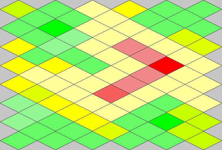
As I’m sure all of you can deduce, there is a vast amount of information that can be displayed in this way. To display such a vast array of possible pieces of information we need a special set of tile graphics, which are made up of a single color. There will be many colors, but only a single color on each individual tile. Since it is widely accepted that green = good and red = bad, while yellow = “middle ground,” I suggest we use that color scheme for the tiles, with at least 5 different shades of each color, giving a minimum of 15 varying shades of color.
So to answer the initial questions, “Where is most economic activity occurring in my empire?” or “Where is all my imported oil coming from?” we switch to the economic theme on selector one, then switch to “Province – Economic Rank” on selector two. This changes the map display to the colored tile interface, showing green tiles where economic activity is high, yellow where moderate, and red where low. Then we switch selector two to “Civ – Import (Oil)” to answer question two.
I originally saw this concept used in a game called “Superpower.” If you haven’t heard of it or played it, here is a link to screenshots of that game:
http://www.golemlabs.com/superpower/
The screenshots there show the “themed” views, specifically the topmost one (Demography). You can download a demo to Superpower 1 right there under “downloads” as well. Here’s a link to the Superpower 2 demo, if you’d like to try that one out:
http://www.superpower2game.com/
And finally, a mock-up of a civ answering the first question (assume all the light gray tiles are outside of the civ in question):
 Attachment: theme example.gif Attachment: theme example.gif
This has been downloaded 63 time(s).
|
|
| |
|
|
|
LDiCesare
|
|
La Ferté sous Jouarre France
Jan 2001
time: 05:33
|
|
That's a good design. I think there's no reason to limit oneself to 15 shades. It's easier to create a continuous set of hues between red and green based on the value we're looking at than to check in which range they fall. The only reason I can see to limit the number of colours is the graphics card, but it's up to the hardware to interpret the colours we'll be throwing at it and display it however it can.
I think I'd like to see the foreign tiles as they are or to use these colours as filters (change the hue of every pixel of the square to the hue we want to display, but keep the luminosity), because I would be unable to remember which tile is what on a mostly-land map.
The only stat to be shown I can think of for the moment is the unrest level. Stats like ethnic distribution can't be made as simply, as you need a first menu to chose which ethnicity you're interested in. For these, I'd rather have black or gray instead of red when an ethnicity is not present.
|
|
| |
|
|
|
LDiCesare
|
|
La Ferté sous Jouarre France
Jan 2001
time: 05:33
|
|
Here's an example form an in-game screenshot. I don't really like it because what I'd like to do doesn't work
(for those who know java, wha's wrong with this:
return new Frame().createImage(new FilteredImageSource(base.getSource(),this));
with
public int filterRGB(int x, int y, int rgb)
{ return rgb; }
yields a black image instead of the same image...
)
The shade is between red and green depending on the severity of riots. I should probably pick a color which is not kaki when the riots are mild.
I'd like to have the image be a grayscale of the original terrain, and then replace the hue by a shade of red, but the APIs in java are not made to make this easy.
 Attachment: colors.jpg Attachment: colors.jpg
This has been downloaded 46 time(s).
|
|
| |
|
|
|
LDiCesare
|
|
La Ferté sous Jouarre France
Jan 2001
time: 05:33
|
|
Yes that could be done. But I'd like to be able to have a grayscale image, something like this.
It may not be the best for riots, but it would be better than straight colored diamonds if we want to show a map of ethnicities, money, demography or whatever.
Furthermore, wisps of smoke and fire would have to look ok on every kind of terrain, and that would be pretty hard for the artists as there are many tiles, including tree tiles, mountains and cities, and you'd expect fires to show well for all of them, which is probably hard to do.
Note that I don't think we should display such red squares unless the player explicitly asks it. Fires/smokes on the other hand could be shown every time.
If I could understand the color api's of java, I'd be able to experiment more 
 Attachment: forest.png Attachment: forest.png
This has been downloaded 41 time(s).
|
|
| |
|
|
|
LDiCesare
|
|
La Ferté sous Jouarre France
Jan 2001
time: 05:33
|
|
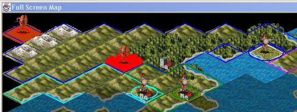
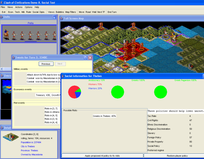
I finally got around the java APIs in order to get the program to do what I wanted. So here's what it looks like now. In this screenshot, I left the policies to the default policies, and this led inevitably to Greeks protesting against the macedonian yoke. You can see that some squares have turned bright red. That's because they are VERY unhappy. You can get shades of red which actually show the progression of discontent, while keeping the actual tiles graphics beneath. So a green tile will be green with no riot, brown with some and red with a lot of riots, like here.
This view is turned on when you select the appropriate menu in the 'Map Filters' button. I don't like the fact it's a button, will probably try to change it into something better, like a combobox, the day I decide I loathe the UI more than I loathe programming user interfaces.
<rant>
Just for ranting, don't use RGBFilter classes to filter BufferedImages in java. Although BufferedImage is an image and RGBFilter can process images, it can't process BufferedImages correctly. So much for object-oriented programming.
</rant>
I'd like to add other filters to the map. The things suggested so far that I think can be done are population and number of sites. These aren't really filters, they would change the color period. Percentage of persons of ethnicity/religion X would be cool too, but it requires a menu to prompt for selection, and considering how poor our menus to handle that are right now, this will probably be deferred after I clean up these menus.
Menu proposal
Speaking of menus,
The user interface sports many buttons, which are redundant with the menus. These buttons eat a lot of space, and don't behave very well, for instance if you want Econ, you then have to choose province/civ/square. But this appears in a position which is hard-coded and may not always be convenient. IF it was a submenu, it would appear to the right of the initial choice (econ) and the player wouldn't have to move the mouse far away just because she doesn't have the same screen resolution as the programmer. So I can make the menus better. But then what of the button? I'm in favour of either removing it altogether (the windows can be iconified and thus reached from the icon or from the menu). or replacing these by a button with a drop down menu. Such drop downs are usually combo boxes, which means the last selected choice remains visible. Incidentally, it might even speed up the Walls button a bit since I could do the lookup of possible walls to build in a different, faster, way.
Of course, all this requires me to code user interface, which I dislike, so I'd rather go ahead only after hearing what everyone interested thinks of this.
Attachment: social2.png
This has been downloaded 31 time(s).
|
|
| |
|
|
|
alms66
|
|
Louisiana
Oct 1999
time: 23:33
|
|
That looks pretty sweet Laurent. 
One thing that seems odd though is that the rebels in the north aren't "red" as well. Is this because the riot has ended, but the rebels remain?
_Edit_
Do you still need the images in greyscale? I've set up a pallette that will do it if you'd like. See the image in the next post.
_/Edit_
As for menu suggestions and wanting to get rid of the buttons, I agree and I have much more to that interface proposal I've been wanting to put forward (if you'd like to hear more about it, send me an email or something), but noone seems interested in doing an interface overhaul. IMO, it would only benefit Clash to do so (a bad interface can leave a sour first impression on most people), though I'd suggest holding off until after demo 8 is out at least.
I think I've said it before, and I'll say it again, right-click menus are a must. Every windows program I've ever used has made use of them (including Civilization & Call to Power). They are simple, intuitive, and easy to use, from a user's perspective and they are easy to change on the fly, easy to implement, and well-known, from a developer's perspective. These pop-up menus are much easier to use than the menu bar for the user, since they require less back-and-forth movement.
As for the social scenario...I'd suggest giving the player 3 armies (of 50-75% of the current Army's total power), one in the east, one in the west, and one at the capital. Having the extra firepower around will help take care of some of the rebels. In addition, I'd also suggest a slight decrease in the likelihood of riots. In the introduction screen, it would also be a good idea to tell the player to look at his social screens before doing anything else.
Last edited by alms66 on 15-11-2004 at 16:44
|
|
| |
|
|
|
alms66
|
|
Louisiana
Oct 1999
time: 23:33
|
|
Here's a greyscale version of the current forest tile:
Edit Note: This one is a little dark, I can easily lighten them.
Attachment: example greyscale.gif
This has been downloaded 26 time(s).
Last edited by alms66 on 19-11-2004 at 06:08
|
|
| |
|
|
|
alms66
|
|
Louisiana
Oct 1999
time: 23:33
|
|
These things are rather easy to do, and I've been wondering it for quite some time now, so I may as well finally ask the question. Why have we yet to implement a true minimap (or pixilated tile map), as in Civ incarnations, rather than the current 'extremely zoomed out' minimap we have now? Is it that everyone actually prefers the current method or some other reason?
|
|
| |
|
|
|
alms66
|
|
Louisiana
Oct 1999
time: 23:33
|
|
The minimap is usually a pixel map equal in size to the tile map. So if you have a 100x100 tile map, you create an off-screen image 100x100 pixels in size. Each tile has a color associated with it, desert might be tan, hills are green, flat is light green, forest is dark green, mountain is gray, etc. So where any given tile is, you draw a single pixel of the associated color. When the image is fully drawn, you stretch it to fit the minimap panel's size and draw it there.
That shows the geography. If you want to show ownership with the player's color, you change the pixel to the player's color. Cities can be shown (via a red pixel or some other bright color). Units can be shown. Various other things can be shown as well, depending on what's needed, and their are usually various toggle buttons to turn different views (cities or units for instance) on or off.
|
|
| |
|
|
|
alms66
|
|
Louisiana
Oct 1999
time: 23:33
|
|
Laurent,
A thought just occurred to me as to why Superpower uses red and blue to denote intensity in their maps (remember the game that sparked the idea). What they are doing is moving the hues of red and blue, lockstep, in an inverse fashion. It's kind of obvious in hindsight. 
For example:
If blue is 255 then red is 0
When you move blue 20 points towards 0, then red moves 20 points towards 255.
This is the reason their 'medium intensity' is purple (I suggested yellow origionally). So, if we set the filter to show on every sqare, blue (R0,G0,B255) would indicate no chance of riots, purple (R127,G0,B127) would indicate 50% chance, and Red (R255,G0,B0) would indicate 100% chance of riots. In this way, red should always be bad and blue good.
I would really like the intensity map to show up on every square as suggested above. I personally think it would look better than the current way you've done it, where only one square shows up here and there in red. I think it would also be a tad more informative.
|
|
| |
|
|
|
LDiCesare
|
|
La Ferté sous Jouarre France
Jan 2001
time: 05:33
|
|
I understand what you say, in fact what I did was to make an average of the current color and red instead of blue and red. I find it ugly (and a bit hard to remember what square is what, particularly in a landlocked map)when all the map loses its terrain features. I can change the whole hue, but you'll get a mostly blue map with some reds here and there.
The problem is I'm showing riots that happened, not potential ones. I could try to get that info again, but it's not an information I keep so I'd have to recompute it a bit often, or change the way the data is stored in order to avoid recomputing riot probability every 5 ms.
If that's only a color problem you have and not a one square here and there (i.e. it's not visible enough for you the way it's done now), please state it that way, for I may have misunderstood you.
Bump that thread sometime when you think I have forgotten it, since I'm not working on it right now, but I think it's worth showing the probability.
|
|
| |
|
| |
All times are GMT. The time now is 05:33.
Apolyton Time is 00:33. |
top of page
|
|
|
Forum Rules:
You may not post new threads
You may not post replies
You may not post attachments
You may not edit your posts
|
HTML code is ON
vB code is ON
Smilies are ON
[IMG] code is ON
|
|
|
|
|
|





 30-03-2004 19:45


 |
|
 |
|