|
| |
|

|
yellowdaddy
|
 |
Saoir-Ebhor, Sasainn a tuath, Rialtas Aontach
Apr 2003
time: 05:33
|
|
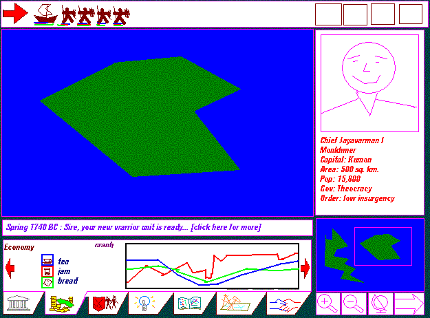
Here's a very rough sketch of what I think could be the basis of an eyecandyful (?!) graphical interface for the main screen of the game, based on the current layout.
the topsection is for buttons... (but could also be for units to show how many you've got when stacked) but I'm not entirely sure how many buttons and pages there are supposed to be... (do let me know anyone)
i think having lots of windows is messy, and something with tabs and scrolling is more desirable for tidiness and userfriendlyness.
I think also it's desireable to have the least amount of text, and replace it where possible with visual data and symbols where possible so that language is not a barrier.
i also like graphs for my data - there may be times when knowing the exact figures for things is useful, but I want to see trends over long and short periods without having to jot down or remember figures for growth etc...
i've put a sketch of the econ page with commodity boxes and general graph side - I actually think it'd be better to have an icon for each commodity and sector (there'd be a lot more), with a graph and key, and if you want specific data you click on the commodity or sector icon to open up a subscreen where the graph was.
I also have ideas for a simple radar-style battle screen (likw wht you get in sports games] - i think it'd be a drastic improvment on traditional unit on unit action, and make battle tactics more doable - i don't like the text idea - it's like archaic soccer games.. but then i'm more visually inclined..
Jack

I'm going to have to e-mail the gif to mark, because I can't rememebr what my webpage is, and i don't think i've got the uploading stuff set up on this pc!!!
|
|
| |
|
|
|
yellowdaddy
|
|
Saoir-Ebhor, Sasainn a tuath, Rialtas Aontach
Apr 2003
time: 05:33
|
|
the current layout is reminiscent of Civ2 : Test of Time.
I understand the flexibility argument, and there seems no reason why a marriage between windows for those who love them, and a fixed display for those who don't couldn't be an option on the game paramaters screen.
I personally like a game to look more like a game, and less like an application (if you know what I mean). it irritates me to have piles of little windows which i have to sort through to get at the info i'm looking for. I'd like less boxes/windows for a start, and preferably in fixed positions. (thought I suppose there could be a little optioanl rearrangement.
this layout is purely an instictive one (i.e. I haven't thought too deeply about why I've put things where).
But on reflection, I think it might be worth sacrificing a larger visible "map" screen for the benefit of having easy/visible access to data.
In Civ3 you get popups not just for events but for city management.
I'm just thinking you might like to use the main map screen to display the data you're looking at (eg. were your units are, you roads are, resources...) while the tab box contains the graphs and figures.
imagine a war, where you have to monitor multiple units and fronts, it strikes me as more efficiant to have the main map screen usuable at the same time as the tabs box (in Civ 3, you get popups and whole screens blocking the main map, and apparently stopping play which may not be the best way of doing it).
(I still don't know how many buttons and screens there need to be!)
I hope we'll get some comments (at least ayes or nays) on the layot so we can get to work on making a pretty one...
|
|
| |
|
|
|
wombat42
|
|
Aye! I like it. Reduces clutter - and not all the boxes we currently have fit, so we have the "fishing" to find things and what not... So I give my support to this new one, with the fancy tabs and what not.
|
|
| |
|
|
|
Mark_Everson
|
 |
Canton, MI
Jan 1970
time: 00:33
|
|
Jack, thanks for trying to push the graphical design forward. As Gary said there has already been very significant discussion on the topic. I don't want to start all over again from square one. To that end, I will give some links to previous discussions.
First of all, there is the Interfaces Page on the web site. It hasn't been updated recently, but has links to some thoughts of a previous team member, and some of the older discussions.
The latest organized discussion on GUI stuff is here.
Then there is the new Economy GUI thread. This gives the planning for what one of the important sub-screens of the GUI would look like.
I just found the threads by paging back through the forum. Took just a few minutes. If you do start a thread about a big topic, please look for the previous discussion threads (at least in the last 3-4 pages) and link them in. That way people won't have to look for them themselves. Or even worse, spend a lot of time to recapitulate the old discussions. And I don't want to have to make my smarmy points all over again. 
Now, on to your stuff. . .
Your interface suggestion looks basically decent to me. The tabbed info screen at the bottom seems worthwhile and functional yet attractive (within the limitations of the sketch). As Gary said, he and I had a difference in our prefered screen locations, and the current GUI handles that well. If I can have that flexibility with the sort of thing you're looking for then I'd be happy. Also, you need to keep in mind things like that lots of players Hate graphs, so I don't think they have a place in the main interface.
|
|
| |
|
|
|
yellowdaddy
|
|
Saoir-Ebhor, Sasainn a tuath, Rialtas Aontach
Apr 2003
time: 05:33
|
|
Smarmy?!  
ok, I hear you.
I want to make a start on something, but I don't want to rile people by pushing ahead with something that a significant number of people don't want.
so I'm looking for swift agreement on as much as possible, so i can get on with it.
I like graphs, you don't. I don't know how many people are for or against, but I also like text/figures sometimes too; my proposal includes both - you have the list of icons for commodities units cities whatever and clicking on the icon would switch between a graph and text/figures.
I think that's a plausible and equitable solution.
Are you proposing having graphs on seperate area subpages?
i.e.: you click on an Economics page and get all you national data which you can have displayed in figures or graphs?
The interface I'm proposing is about not having loads of pages to click to.
I have thought that, it might be an idea to make this interface a tab in itself - the main game page being without the three boxes to the right, right bottom, and bottom, and with the map filling the screen and just the basic top row of data and buttons, and the events ticker tape thing along the bottom?
much like this suggestion:
quote:
Simon Loverix
Tongeren, Belgium
21.01.03 16:25
Heroes of might and magic 2 had both a full-screen mode and a windowed mode (which was identical, but with a window around it); practical.
(AND THIS WAS USEFUL TOO):
Simon Loverix
Tongeren, Belgium
27.01.03 16:41
Laurent:
Imperialism did the permanent message bar. They showed a graphical representation of goods and moving the cursor over it would make the exact quantity appear over there. Very practical.
as were Bruns' thoughts on popups
|
that was a year ago - what happened to Vovan's gfx?
What are your personal requirements for the interface?
My personal attitude is to just keep amending the sketch and posting it until everyone in the team is happy, and then make it pretty.
Laurent's e-mail didn't seem to work, and i think his input is needed as well to proceed.
I will absorb that stuff over time - I have difficulties reading, so bear with me (i'm off to the optometrists in a couple of weeks!)
I wouldn't mind some kind of tree or map or flowchart or list of buttons and tabs and pages that are required...
at least tell me how many buttons? or do i just make as many as I like?
------------------------------------------------------
New topic: tiles: I know this has been brought up before, but i'm looking for permission to redo them...
I think the tiles are:
a. too small.
b. not entirely uniform in style.
c. not enough of them.
a. I think 48 x 48 is much more attractive. If we go for the revised interface proposal - where you can have the map filling the whole screen, and switch to the boxes and smaller map, then I think you definitly need bigger tiles. But I think you need bigger tiles anyway.
b. Basic stuff like horses and men are varying sizes, point different directions, and don't seem to have a unifrom style or pallette.
c. not really a complaint, but how many units are required?
Until I see gary's map, I've no idea what to do about units and terrain. What city tiles might look like or any others for that matter, so I wait with baited breath...
|
|
| |
|
|
|
LDiCesare
|
|
La Ferté sous Jouarre France
Jan 2001
time: 05:33
|
|
quote:
Laurent's e-mail didn't seem to work |
What did you use? Tried laurent.di.cesare@wanadoo.fr ? If this doesn't work, PM me, I'll try to give you another e-mail address.
I think the most important thing about graphics now is to have something more uniform in the various panels (econ, military, government...), in particular whether they are frames/windows/panes...
I don't like graphs much, but those in galciv work well enough to show every civ's power (though you get it for free instead of spending on intelligence, which I think is bad, but has been done to make it easy for the ai).
|
|
| |
|
|
|
Mark_Everson
|
|
Canton, MI
Jan 1970
time: 00:33
|
|
quote:
Originally posted by yellowdaddy
so I'm looking for swift agreement on as much as possible, so i can get on with it. |
I'm with Laurent, at least what I think he's saying, that we should work on the sub-menus first. Making them functional and having the code standardized is IMO Much more important than re-doing the main interface. At least from my point of view, you can go ahead with your explorations. . . But I fear you'll get frustrated because this isn't near the top priority. That said, some of your ideas, like the tabbed panel might be coded as a frame and put into the main GUI in a reasonable amount of time if we as a group decide that's the way we want to go. Another factor to be considered is effort to make the changes you are promoting. Easy-to-code things can of course be tried with much less agreement and forethought than hard-to-code ones. Laurent and Gary's evaluations will be key here.
quote:
I like graphs, you don't. |
Actually, I personally like graphs a Lot! Just wanted to register something that I think is true about the civving community. I certainly could be completely wrong in this assumption.
quote:
Are you proposing having graphs on seperate area subpages?
i.e.: you click on an Economics page and get all you national data which you can have displayed in figures or graphs? |
Graphs should be used on the popup screens like econ etc. as needed IMO.
quote:
The interface I'm proposing is about not having loads of pages to click to. |
I don't think that approach is practical at all for a game that is as data-rich and player-decision-rich as Clash. At least looking at your example I don't see how you can possibly get all the critical econ info into one of those little tabbed pains you have. Maybe I'm misunderstanding you. . .
I have thought that, it might be an idea to make this interface a tab in itself - the main game page being without the three boxes to the right, right bottom, and bottom, and with the map filling the screen and just the basic top row of data and buttons, and the events ticker tape thing along the bottom?
quote:
that was a year ago - what happened to Vovan's gfx? |
No idea. Presumably the web site they were posted on got shut down.
quote:
What are your personal requirements for the interface? |
Its in very large amounts of detail in those threads. Like I said I haven't much time to work on Clash right now, so I am not interested in generating new posts to say things I've already said in those prior threads.
quote:
My personal attitude is to just keep amending the sketch and posting it until everyone in the team is happy, and then make it pretty. |
Well, making everyone happy is going to be tough! See Gary's comment on why the current interface is flexible.
quote:
I wouldn't mind some kind of tree or map or flowchart or list of buttons and tabs and pages that are required...
at least tell me how many buttons? or do i just make as many as I like? |
Trying to make a final interface design right now is really futile. Only playtesting will tell what really needs to be in the top interface IMO. I'm not trying to be difficult, but coding a bit and then trying things is what has worked best in this project. So my suggestion is to just make an interface based on what you see currently in the game and leaving a bit of room.
quote:
New topic: tiles: I know this has been brought up before, but i'm looking for permission to redo them... |
This whole part of the post should go in the terrain graphics thread, or a new one should be started. If lots of different big things get discussed in one thread it becomes a real nightmare to have a coherent discussion and to link back to with future threads.
Sorry I'm being such a pain, just becoming more curmudgionly with age I guess.
|
|
| |
|
|
|
yellowdaddy
|
|
Saoir-Ebhor, Sasainn a tuath, Rialtas Aontach
Apr 2003
time: 05:33
|
|
Hi Mark and Co.
I'm splitting my reply in sections, for no particular reason.
----------------------
missed quote response section:
I think you meant to quote me on this para' and respond to it, am I right?
quote:
I have thought that, it might be an idea to make this interface a tab in itself - the main game page being without the three boxes to the right, right bottom, and bottom, and with the map filling the screen and just the basic top row of data and buttons, and the events ticker tape thing along the bottom? |
---------------------
discussion retort section:
I take your point about not wanting to go over stuff again and again, but i'm not sure whether some of the questions i'm asking have been answered in a way that I can make sense of, unless my questions aren't phrased well.
I can't read all that stuff that quickly (I have a reading disability) , I would really like it boiled down into a "home assembly kit" or Lego instructions. in short, less words please!
going ahead with the interface as a "conceptual" one, will keep me ticking over, and help me arrive at an overall style for boxes and things. So I do regard it as entirely futile from a graphics perspective. I just want to have a visual reference for what kind of direction to go in with the graphical style.
So far, Gary's asked me for a couple of things, an ancient transport ship unit is one - but on looking at the other units, my first thought was they were too small and not uniform... (self-snip!)
...So I'll take it as an OK to proceed.
-----------
little afterthought section:
I thought it might be tidier to tackle my graphics queries ad hoc on this thread - it works for me anyway because I don't have to trawl through loads of old posts and try an interpret them or ask regurgitative questions.
---------------
instructions section:
So submenus, what do you want? (specifically please)
quote:
I don't think that approach is practical at all for a game that is as data-rich and player-decision-rich as Clash. At least looking at your example I don't see how you can possibly get all the critical econ info into one of those little tabbed pains you have. Maybe I'm misunderstanding you. . . |
I'll take it that we're going to have whole pages then, unless there's a way of fitting the data on the panel.
Is the main page going to be a map screen like in Civ or a Government screen with access to the other pages or something else?
--------------------
Waffle section!
Graphs.
I would like to see graphs mainly in the economy and social screen. a bit more than the old demographics screen.
I would like to see Graphs used for the following:
growth rates:
economic, (national, sector, balance of trade)
population,
law and order,
I'm not sure whether you really need them for anything else... perhaps resource/commodity prices
I actually don't see the point in a "power graph", especially when playing the game - isn't in more tense to not be entirely sure how powerful other Nations are, and more realistic?
-------------------------
|
|
| |
|
|
|
Mark_Everson
|
|
Canton, MI
Jan 1970
time: 00:33
|
|
quote:
Originally posted by yellowdaddy
I think you meant to quote me on this para' and respond to it, am I right? |
No, not really. I dislike the idea, but felt no need to comment.
quote:
I take your point about not wanting to go over stuff again and again, but i'm not sure whether some of the questions i'm asking have been answered in a way that I can make sense of, unless my questions aren't phrased well.
I can't read all that stuff that quickly (I have a reading disability) , I would really like it boiled down into a "home assembly kit" or Lego instructions. in short, less words please! |
Well, I understand your limitations now that you state them. But I have no desire to spend hours of my own time condensing things for you. So we're at an impasse on this one. I suggest you read the starting bits I put up FE in the thread on econ design. That'll at least give you some idea what I had in mind.
quote:
I thought it might be tidier to tackle my graphics queries ad hoc on this thread - it works for me anyway because I don't have to trawl through loads of old posts and try an interpret them or ask regurgitative questions. |
You don't need to read all the old posts in a thread, just put your questions/ideas on the end. Threads like this with tons of different ideas on different facets of the game tend to get ignored once active discussion is over. And then we have to answer the same questions and discuss the same ideas when the next new person comes on the project. Well, I don't have the time or desire to do that.
You can do whatever you want and post where you will, of course. But the purpose of this forum is to allow for current discussion of topics and also preserve those discussions in an organized fashion. I'm going to be reluctant to spend time on things that don't fulfill that second function. You see, people join and leave the team all the time, and most just waste time in forum discussions and never do anything. Until it is shown that you're not in that category (and nothing personal, I'm just going with the odds) I'm not going to spend a lot of time discussing. . .
Why don't you do some of those little projects Gary suggested first, and "earn your spurs"? You can try different styles and sizes for images, and we can see what you can do with graphics.
quote:
So submenus, what do you want? (specifically please) |
See my first post in the econ sub-menu discussion. You could start with your take on what that should be. But IMO supporting the coders with what they need right now is much more important. In many cases we will probably try three or four interface possibilities for a sub-menu before it's finalized.
|
|
| |
|
|
|
LDiCesare
|
|
La Ferté sous Jouarre France
Jan 2001
time: 05:33
|
|
About submenus:
Click on every button we have on the top. Almost none of them does anything consistently:
From left to right:
Exit: Well, it just quits the game. Can't really have anything like the other buttons.
Econ: Opens a small popup telling you which econ window you want. The next window can be closed or iconified, and is called back and put in front if the button/popup is clicked again. The window has little or no border and is plain text, can be adjusted horizontally but there's no horizontal adjustement if you increase the size of the window.
Tech: A full-fledged window, with a much bigger button to close it than the econ one. Can't be iconified.
Mili: Same as main econ window(not sure you have this one unless you have the most up-to-date code).
Ruler: Same as mili.
Diplo: Same as mili. Except this one does nothing, off course.
View: Opens a popup menu in the middle of nowhere. Econ opened the popup near the button, but I get this one very far from it.
Bulletins: Can do nothing (if there haven't been any bulletins). Otherwise, opens a popup menu, which tehn opens bulletins like the tech window.
Move: Switches to End move if you selected a unit. And vice-versa.
Road: As move, except title is End build.
Wall: A mix of econ (popup menu) and Move (End build). In this case, the popup is near the button, but often sports a single choice. If no wall's available, I don't remember what happens.
Next TF: Causes selection to change.
End Turn: Opens an Events panel, which can be closed, can't be iconified, can be made to fill the whole window. In order to call back the event, you must go through the very intuitive options-display events-view events.
This 'options' thing lets me introduce the menu bar. We have both buttons and a menu bar.
Files is here for Exit.
Views is for Econ/Mili/Tech/Views/Bulletins. I really wonder what's the point of doing Options/Views/Views/(click the good one) instead of picking the iconified window.
Action: Provides the rest of the buttons.
Options: Introduces Reset Layout, which sounds right there, and Display Events, which doesn't really cut it.
Help is the usual unhelpful about that Windows has had us used to.
You may see now what I mean in terms of things needing unification. There are windows that can be reduced, others which can't.
There are other buttons which, sometimes after a selection in a list, require you to select a target square.
And then we have all the contextual menus, on the main map and in the units window.
So coming with a plan to have something more ergonomic would be nice. That's not as much graphics as it is ergonomics, but it's more important than mere graphics. The end-of-turn messages could in fact be helped by graphs for tech/econ/pop growth. But thinking about how to check pop growth by square vs. by province vs. by civ is also important.
|
|
| |
|
|
|
yellowdaddy
|
|
Saoir-Ebhor, Sasainn a tuath, Rialtas Aontach
Apr 2003
time: 05:33
|
|
Ok Mark, I'll do my best.
I'll try and direct my queries to Laurent and Gary as you suggested and try and do what I can to supply the gfx they need.
merci Laurent pour votre input!
(in addition to Gary's specific requests) shall I treat the map screen as having a map which fills most of the area
(basically like a web browser I suppose - or a bit like Sim City 1 which had little vertical colour bars up the lefthand side to show population levels in the 3 types of zones)
and then do tabs along the bottom (or top) for the other pages which currently use the buttons: econ, mil, rule etc...
on the side (which i suppose could also be switchable to left or right like the pagetabs could be from top to bottom) i could do tabs which make a minimap flip out (or it could scroll out over a small corner of the main map), and for a databox in the top right (but relocatable) with its own minitabs inside it, which could act like a popup displaying things like:
1. a character face - eg: your ruler, an opposing ruler, one of your ministers reporting something (with accompanying summarised data below), perhaps and
2. event slide (like and image of famine, or military victory...),
3. perhaps a mini growth trend graph at the start of each turn
4. Unit managment - with squashed arrows for (mulitdirectional) rotating through units, locations etc...
This circumlocated tabs approach keeps the main map clear, and allows the player to choose what data they want on screen with the map, and within certain limits where they want these little panels (the panels being fixed to the edge of the screen, not annoying floaty boxes - it's not photoshop, it's a game!). And this screen treated as a large tabbed page, allows for fullscreen pages for the other things like the research/tech page, economics page and whatever else.
I could also then put a space for a national flag:
I think this could be a useful way of identifiying units freeing up colours that might otherwise be used for nationalities and put constraints on the number of nations and vassals possible in the game (i.e.: identifiable).
It'd also be nice for historical scenarios.
I think a little flag designer, with a small palette, and small set range of flag designs would be feasible in the options page.
Until/unless it's coded, the box can display a Clash logo.
With larger 48x48 px units, a little flag overlay of say 12x20 in the top corner seems doable. (though the US flag might have to have only 5 or 6 stripes! and oceanian flags might be a bit fiddly!)
a strip of space along the top for displaying contents of stacked units, a little panel of buttons (move, build etc..) along the bottom with a ticker-tape bulletin with date, as before.
as for the point about graphs - how about when graphs is selected on the datapanel minitabs, the player could just click on the map: a right click menu asking you to select unit, square, province or nation? (this could apply to other things too perhaps?)
I'll work to all the specs i can find, and then mail things it to Laurent and Gary if i can before posting them on the forum.
bon?

Last edited by yellowdaddy on 08-02-2004 at 19:01
|
|
| |
|
|
|
yellowdaddy
|
|
Saoir-Ebhor, Sasainn a tuath, Rialtas Aontach
Apr 2003
time: 05:33
|
|
fair enough,
but I'd like to post gfx to someone/where else for backup purposes as much as anything...
re units box,
in that case I'll treat the two tabs I call "datapanel" and "minimap panel" as fixed features as in the sketch above, but try and make the map as big as possible while keeping the y dimension no longer than the x, unless suggested otherwise. each panel about an eighth of the screen, and portrait shaped.
So essentially, just removing the landscape-shaped panel below the map, while retaining the tabs which will serve as the buttons on the current demo. (more or less).
(feel free to delete the sketch at your convenience)
but not the ones here please, which i think are worth retaining for reference...
http://apolyton.net/forums/showthre...&threadid=82813
Last edited by yellowdaddy on 08-02-2004 at 21:32
|
|
| |
|
|
|
LDiCesare
|
|
La Ferté sous Jouarre France
Jan 2001
time: 05:33
|
|
quote:
(the panels being fixed to the edge of the screen, not annoying floaty boxes - it's not photoshop, it's a game!). |
I actually like windows that I can rearrange and move.
|
|
| |
|
|
|
Gary Thomas
|
 |
New Zealand
Mar 2001
time: 17:33
|
|
While graphical interfaces are an interesting subject, they are likely to be coding intensive. Combine this with the fact that they are a relatively low priority essentially means that anyone suggesting extensive work in this area will have to do the coding themselves. I certainly have much higher priorities, and I assume that Laurent is in the same position. This means that any development of graphical interfaces, at this point, will probably not lead anywhere and just cause frustration.
However, units and terrain (and leader portraits) do not need any coding to implement - just minor changes to the scenario files, which are easily(?) edited text files. My personal second priority (after save/restore) is a scenario editor. So graphic efforts directed to that area will see the light of day almost immediately.
Cheers
Last edited by Gary Thomas on 13-02-2004 at 06:55
|
|
| |
|
|
|
Gary Thomas
|
|
New Zealand
Mar 2001
time: 17:33
|
|
quote:
i don't like windows at all |
Given a choice between something that is just a personal preference, such as your dislike of windows, and something that adds functionality, such as the ability to move them around and change their sizes (and have the program remember your choices, which it does) then I must plump for the functionality. To remove functionality because someone doesn't like it is pretty much against the tenor of reasonable programming.
On the other hand, unconstrained popups irritate me. We originally had a message window, that all the information went to. Unfortunately it scrolled past so fast you couldn't read it. The present system is pretty much a compromise, to get things operating.
Cheers
Last edited by Gary Thomas on 13-02-2004 at 06:56
|
|
| |
|
|
|
LDiCesare
|
|
La Ferté sous Jouarre France
Jan 2001
time: 05:33
|
|
quote:
windows that are of fixed size |
That's one feature I hate in Windows (the OS): they managed to create windows you can't resize or move. When suddenly, for an unexpected reason, the text to display is too big, you are stuck. I've see screens which were impossible to use because a text field couldn't be enlarged and its size was fixed for English language. In Japanese or Chinese (kanji) it was too small.
I also generally stop browsing any web site that uses flash (fixed layout) or uses fixed fonts because, even though the people who did the site may think of it as nice, I feel I can't use that.
Now ToT had a nice enough default layout and the windows were nice enough that you could leave them as is most of the time, but could change it, particularly when switching from one resolution ot another (800x600 and then going 1024 will mean you will probably want more space for the main map for example).
We have too many popups, this I can agree with, but I can't think of anything better right now (or anything I'd like to code now, to be more precise).
|
|
| |
|
|
|
yellowdaddy
|
|
Saoir-Ebhor, Sasainn a tuath, Rialtas Aontach
Apr 2003
time: 05:33
|
|
so we can settle on having less windows, which you can change the dimensions of and move around, and these windows perform a fixed set of functions.
ok
well, the interface i've drawn can allow for that (i can add windows features round the edges)
and i've done a little tabbed data box where all the pop data could manifest itself...
i'll send you a WIP gif if you like...
Last edited by yellowdaddy on 14-02-2004 at 14:52
|
|
| |
|
|
|
Gattsuden
|
|
Hi, im new to the forums. I am an artist and I would like to help this project.
I like to do logos and crap, and I would like to get some exp making GUIs and other things. I can do sprites, vector, traditional and digital art too. I work pretty fast, and can handle most art related tasks.
Ive played the demo, and I must say it is difficult. I tryed to fight the barbarian, but both of my units were beaten.... Also I never figured out how to make my population use the farms...
If you guys want I can get started on anything right away.
Contact me through AIM SN is Gattsuden
Last edited by Gattsuden on 28-03-2004 at 04:24
|
|
| |
|
|
|
yellowdaddy
|
|
Saoir-Ebhor, Sasainn a tuath, Rialtas Aontach
Apr 2003
time: 05:33
|
|
welcome, bienvenue, failte, bienvenudos, (etc..) Gattsuden! 
please check my webpage on my signature for my efforts so far.
I'm trying to gather together the graphics into a place where everyone can keep track of what's what.
There are more gfx than this of course, but it's a start.
As you can see the most recent thing I've been doing is
drawing ship units.
I've posted a thread call the "Graphics To Do List" so we can all keep track of what's been done and what needs doing.
I think only Gary and Laurant are actively coding at the moment, so I look to them to get ideas on what needs doing.
I think on the horizon there'll be a need for a new set of
terrain overlays, but for now may I suggest you have a go at doing a set of ancient land units?
The reason being is that the human units that exist already aren't uniform in style or size.
I think a nice set of ancient world units - Roman, Greek, Persian, Carthaginian/Phillistine/Phoenician (they're the same people really), Barbarian, Mesopotamian would be good.
Especially the Roman and Carthaginian ones as that seems to be the main focus of the demo.
{I think some more oriental ones: Mongol/Turk, Chinese, Japanese, Arab, Indian might be welcome too (Mongolian horsemen, Elephants, Chariots,)}
Laurant's already done some units (this is the current units thread):
http://apolyton.net/forums/showthre...62&pagenumber=3
there's some here that aren't Clash's but you might want to use them as "models" to draw your own prettier ones http://apolyton.net/forums/attachme...&postid=1773797 http://apolyton.net/forums/attachme...&postid=1773797
And some lists here further along the same thread:
http://apolyton.net/forums/showthread.php?
s=&threadid=40462&perpage=15&pagenumber=8
As for terrain, still waiting... I'm not sure when the new polygon map is due or if it will be in the next demo.
There's certainly a need for a set of nice coastal overlays (cliffs, beaches, mangroves, reefs...) and some river and canal overlays.
I was intending to do some City overlays but I'm waiting for feedback on that. I was also about to begin some "flora" overlays - jungle, forest, scrub, but again I'm not entirely sure what's required - ie. whether they are for a 3d iso map or a polygon map...
It'd be great if you set up a free website like I have to post JPEGs or GIFs of completed units, and post what you've completed on the "Graphics To Do List".
Hopefully Gary and Laurant will be able to clarify what's next on the Graphics agenda.
The update is well out of date (Last Update: 1/10/03) , but this was the state of play:
Graphics: {Laurent, Gary, N} [P] WE REALLY NEED ARTISTS!
• Main Interface Layout and Art {N} [P]
• Map Terrain Tiles {N} [P]
• City Tiles {N} [P]
• Army Graphics {N} [P]
• Other Interface Art (many interfaces) {N}
• Misc. (Logo Art for web page, manual…) {N}
from: here
I think we may be able to update this now - it'd certainly be helpful.
Once you've digested this post, please state your preferences for task areas you'd like to take on:
- Personally I like doing vehicle units, but don't like doing human units, so I'd appreciate it if you'd take that one on, but naturally you should do what you enjoy the most. If you have PSP7, you might like to investigate doing animated stick men - so we can have amusing death animations - garotting, exploding, chopping... stick man animations are fun, and might add some amusement to the game.
- I've done more work on character faces than is evident on my site, so I'd like to stick with that one please.  (it's not a high priority thing right now anyway) (it's not a high priority thing right now anyway)
- Interfaces, City Tiles and Terrain tiles we can share  They certainly need more than one person to do, but should be done in sets such as "all coastal overlays", "all land tiles" "all vegetation overlays" etc..., for style continuity. They certainly need more than one person to do, but should be done in sets such as "all coastal overlays", "all land tiles" "all vegetation overlays" etc..., for style continuity.
The diplomacy screen is one that will need some attention - i'll post the thread link on here later.
- Logo Art seems to be right up your street, so fill your boots! 
Last edited by yellowdaddy on 29-03-2004 at 20:39
|
|
| |
|
|
|
Gattsuden
|
|
Hey, nice graphics on your site. You want me to start on some logo concepts too? The unit graphics thread is pretty big, so I am still reading it. I will what i can do to help about units after I finish readin it.
|
|
| |
|
|
|
yellowdaddy
|
|
Saoir-Ebhor, Sasainn a tuath, Rialtas Aontach
Apr 2003
time: 05:33
|
|
Hi Gattsuden,
I don't know if logos are a big priority - but I think if you feel an urge to do something, you should follow it - nobody was particularly enthusiastic about me indulging myself in drawing that oldskool game interface, but i enjoyed doing it, and hopefully it'll influence the final look of the game.
I think if you're interested, doing the "Sumerian stick men" might be worth a go - I'm thinking of "North and South" and "Lemmings" which have great death anims - i think it'd be great fun and a refreshing change from the traditional units like you get in Civ and similar games.
If people only play this game just to watch the unit animations of them being crushed, sliced, chopped, exploded, squashed, and minced then we've done our job - lots of amusing squirty blood, and speech bubbles would be funny.
Just start off with Roman soldiers an barbarians.
Simple small palletes and 4-colour stick men should take the legwork out of it. What do you think?
|
|
| |
|
|
|
Gattsuden
|
|
Static sprites are good. Its alot easier than animation, though I can animate pretty well too. If all the sprites will be static I can work at a good pace.
|
|
| |
All times are GMT. The time now is 05:33.
Apolyton Time is 00:33. |
top of page
|
|
|
Forum Rules:
You may not post new threads
You may not post replies
You may not post attachments
You may not edit your posts
|
HTML code is ON
vB code is ON
Smilies are ON
[IMG] code is ON
|
|
|
|
|
|





 03-02-2004 16:38


 Attachment:
 ) but not a mess of windows please!!!
 |
|