|
| |
|

|
Gary Thomas
|
 |
New Zealand
Mar 2001
time: 17:15
|
|
The present (D5) GUI works as follows:
There is a large window, with some menus, containing:
- A toolbar, currently containing buttons, ultimately icons
- The main map, covering most of the area
- A task force or units box, conating army information
- A "details" box giving information about the currently slected square.
- An "information" box which, essentially, logs events as they occur.
I propose to add a world map soon. The only real function of this is to enable quick jumps around the map - clicking on the world map will centre the main map on the clicked area.
The biggest problem I have at present is that I actively dislike the information box. Normally there is an information overload, and things scroll past too quickly anyway. Many of the messages are obscure, and some are missing, for example there is no notification of a unit being destroyed. In any case, the whole thing is completely indigestible, and, in addition, grows arbitrarily large. I can imagine that in a big game it could become many megabytes long. A minor factor is that it has a persistent bug that causes bits of it to be written to funny parts of the screen.
I would like to take the space that the information box uses for the world map, and replace it with a button in the button bar giving a drop down menu of different kinds of events (for those of you familiar with Space Empires IV, using their style, but a bit more intelligent). In particular, there would be economic events, combat events, technology events. Clicking on one of these would produce a popup list of the events that occurred in the just completed turn. Clicking on one of these would give the details. Ultimately, I would expect some sort of peristent summary of events in previous turns, but the number of turns saved would be a settable option. The previous turns would be saved to disk. Although performance is not currently an issue, this is one area where it is guaranteed to become a problem as long as a huge log is kept in memory.
Cheers
|
|
| |
|
|
|
Mark_Everson
|
 |
Canton, MI
Jan 1970
time: 00:15
|
|
[edit] I just realized there is an old thread that may be of use on interfaces. Here is: Overall Clash Interface Design from Waaaay back.
There is also some good stuff in a slightly less old thread:Demo 5 Interface
Hmmmm, well I agree the Info box is quite kludgey, but I find it rather useful. You can have the space if you want for the world map, but you have to give me something where I don't have to chew through 5 or more separate popups ever time a turn is cranked to see what happened.
How about this... at player discretion an info screen pops up over a fair-sized chunk of the screen when the turn is done. (Leave as much of the main map showing as possible) It can have enough room to show salient details on 5-8 areas of the game. If you want More detail then hovering over the small Econ area, FE, within the info screen will give you a popup with a more detailed report. To issue orders you click on the econ area. Eventually this could be made quite attractive with graphics that support the verbage so that you may not even have to read much of it.
There will also be a button or whatever for the player to get this screen whenever they want. So if they don't want it popping up they can call it when needed. In the future there could be a set of triggers as to whether it pops up or not that the player could set. IE come up when: war declared, disaster of x size, rioting of more than y people...
We can see if anyone else has some ideas from other products or their own brains... But IMO a t a minimum there needs to be some informational readout that can be accessed without having to push a button at the beginning of Every Single Turn.
Last edited by Mark_Everson on 11-11-2001 at 06:40
|
|
| |
|
|
|
LDiCesare
|
|
La Ferté sous Jouarre France
Jan 2001
time: 05:15
|
|
The information frame has proven invaluable for debugging, and it really helps. I agree that keeping more than 5 turns (maybe 10) is pointless. I usually expand it and use it much in order to have details about the output of fights. I definitely don't want to have to go through a popup for that. In later versions, other systems could be made to find out where battles occurred and how they fared, but currently a persistent text window is a must.
|
|
| |
|
|
|
Gary Thomas
|
|
New Zealand
Mar 2001
time: 17:15
|
|
As far as I can see, the main difference between my latest proposal and yours is that yours has all the little details in it, making it extremely difficult to find specifics. Mine will have, in effect, main headlines which can be clicked on to provide detail if required. So it would look like:
Combat in [5, 7], Carthaginians vanquished Romans
Combat in [6, 9], Carthaginians and Romans, inconclusive
New Carthaginian Phalanx built in [5, 8]
Army reorganization, Carthaginian army Hanno II formed
Cheers
|
|
| |
|
|
|
Simon Loverix
|
|
Tongeren, Belgium
Apr 2001
time: 05:15
|
|
Is it possible to use hot text or hot windows (just appearing when you move the mouse pointer over them). It would give you the headlines (+saving screen space) and require only one move and no clicking to see the info. With optional clicking of course if you wanted to make the window permanent.
|
|
| |
|
|
|
LDiCesare
|
|
La Ferté sous Jouarre France
Jan 2001
time: 05:15
|
|
What about a customizable information output?
Qe could have a preferences/settings somewhere, and decide we want in the output window information of various levels:
e.g. Military 3/3, Econ 2/3, Tech 1/3...
I suggest 4 levels, which could be termed as (0)none, (1)minimal, (2)default, (3)maximal.
You'd get a window with all text according to the level of output specified, and, if the level is less than 3, an option to get a popup window by clicking in order to get more information. That way I combine everyone's needs in one window with just a settings to change. It could even be an option to change the settings at run-time when you realize you are always opening one kind of pop-up by clicking somewhere in that pop-up to say you always want more detail.
|
|
| |
|
|
|
Mark_Everson
|
|
Canton, MI
Jan 1970
time: 00:15
|
|
Yeah, I like Laurent's suggestion for long-term.
Gary, I have no problem with your syntax for getting military (or other) info to the player. I think we actually reached agreement, and then I lost track of part of it.  I glossed over in my mind your following : I glossed over in my mind your following :
quote:
Another way of doing it is to have a abbreviated list of events pop up at the end of the turn. As long as each entry is one line long. Clicking on the line will give a popup with more detail. |
This is indeed basically what I wanted, and is Fine 
What I thought I was still dealing with was:
quote:
In particular, there would be economic events, combat events, technology events. Clicking on one of these would produce a popup list of the events that occurred in the just completed turn. |
The latter I dislike because this means (provided I understand your description) that to find out what is going on I need to go to this button/menu item and
1. Click on Economy, view,
2. Click on Military, view,
3. Click on Diplomacy, view,
and it goes ON and ON
And as I said this is ok IMO as an option, but should not be forced upon everyone.
So I think we're back in reasonble agreement and just need to work out a short-term spec for what information is shown.
Cya, Mark
Last edited by Mark_Everson on 25-10-2001 at 17:04
|
|
| |
|
|
|
Richard Bruns
|
|
NC, USA
Nov 1999
time: 06:15
|
|
Copy from the old thread I posted in:
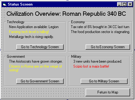
I think that we do need an overview screen that shows the highlights of all models. This would provide a single look at the most important aspects of the civ. It could also be the information panel that pops up every turn, replacing the info box.
Here's a possibility. Note that it is smaller than the real one would be, in order to fit on the forums. There would be a frame for each model, and each frame would need to be bigger to accomodate more information. The real overview would probably fill the whole screen:
|
|
| |
|
|
|
Richard Bruns
|
|
NC, USA
Nov 1999
time: 06:15
|
|
Apparently you can't attach a file when you edit a post if the attachment wasn't sent the first time.
 Attachment: status screen.gif Attachment: status screen.gif
This has been downloaded 87 time(s).
Last edited by Richard Bruns on 11-11-2001 at 23:54
|
|
| |
|
|
|
LDiCesare
|
|
La Ferté sous Jouarre France
Jan 2001
time: 05:15
|
|
Richard, I like your image a lot.
I am not sure how to get the texts as pretty as you had, but that is another matter.
It could be good to add flavor texts when "nothing happens" ( in a special color/font)
Example for the military:
"Our regiment XXX won the inter regiment race this year" (could even give the name of strongest unit here).
For science:
"This year nobel prize went to Dr Burns for his experience on explosives. By blowing up his whole lab, he proved explosives had great potential as a weapon."
|
|
| |
|
|
|
Richard Bruns
|
|
NC, USA
Nov 1999
time: 06:15
|
|
That sounds good. But what happens when more models come online and there are more than four boxes? We may have to find a way to shrink and expand the boxes.
I really liked the interface in the Zeus game in the Impressions city building series. All the information and action buttons the player needed were on a group of panels in the right side of the screen, and the city view was the rest of the screen. Mark, what you describe seems quite similar.
|
|
| |
|
|
|
LDiCesare
|
|
La Ferté sous Jouarre France
Jan 2001
time: 05:15
|
|
Each event list could be displayed only if something happens if se have a 1x4 box, and when there are more models, that would be true too. I guess some models have fairly rare events anyway, like government or foreign ministry, at least not one every turn (rather, the foreign advisor amount is inversely proportional to the number of military). So this display could be OK.
I also think that showing more than 6 items in any event display category would be too difficult (cluttered) to read, however we present them. Either a (more) button could be an option then?
|
|
| |
|
|
|
Gary Thomas
|
|
New Zealand
Mar 2001
time: 17:15
|
|
*bump
Color mentions in his coder description that he has extensive experience in Swing, and Gonzalo has a lot of experience with user interfaces. And they both speak Spanish (while on the subject, don't forget Fiera, from Hispania, and Emporer level, still posting to the Apolyton CS Forums/HostedSites/HS-The Spanish Civilization II Site, who did most of the art to date). Perhaps we can get a subsystem here to work on the gui, while I get onto other things.
Mark and I have been exchanging emails expressing concern at the state of the user interface. Maybe we can use the expertise expressed here to improve the situation.
As I understand it, Color has the deeper understanding of Swing, but Gonzalo's is experienced with user interfaces, but not, I think, in Java. Is this the case? If so, I don't really think that VB experience is going to help with coding (it is only two and a half years since I was employed as a VB expert).
Another thing is that we will not use autogenerated gui code, which tends to give a huge and incomprehensible list of components, all at the top level for the generated component.
That said, I would dearly love for someone to improve the system we have.
There are two immediate problems I have. One i sthat the scroll bars in the task force window do not work correctly, the other is that if you put a slider on a JInternalFrame, then bring it to the front the slider is invisible (it still works though, if you know it is there).
Ideas on fixing these would advance the cause.
Cheers
|
|
| |
|
| |
All times are GMT. The time now is 05:15.
Apolyton Time is 00:15. |
top of page
|
|
|
Forum Rules:
You may not post new threads
You may not post replies
You may not post attachments
You may not edit your posts
|
HTML code is ON
vB code is ON
Smilies are ON
[IMG] code is ON
|
|
|
|
|
|





 23-10-2001 23:17


 For debugging purposes a command-line switch would do fine. Both for debugging and play I would prefer to have a fair amount of critical information up-front in a single view.
  |
|