 |

|
ashbery
|
|
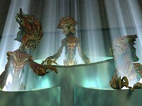
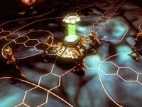
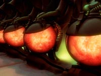
WOW the orions new and old look fantastic
|
|
| |
|
|
|
ruitodobom
|
|
What exactly is that cat doing in the senate?
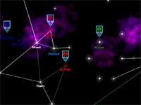
Also... when do we get to see the mouse pointer??
They look awsome!!!!!!!!!
|
|
| |
|
|
|
LDiCesare
|
|
La Ferté sous Jouarre France
Jan 2001
time: 05:23
|
|
There is nice art, but also a few things that disturb me:
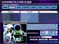
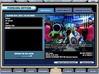
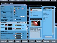
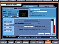
One is silly, but putting cancel on the left and ok on the right for a button is so contrary to what is done everywhere else with computers that there are times when players will curse the game because they pressed cancel instead of OK.
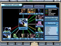
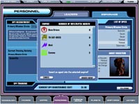
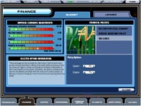
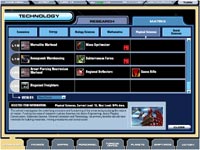
Now there is lots of text, and lots of acronyms. That doesn't help getting into the game.
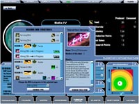
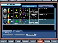
The planet screens look like they will promote micromanagement (MM) a lot. We see only two of them, production queue and DEA. Both are full of lots of clutter from my point of view. Why do I need so much space wasted to show there are two DEA's being produced? Why so much text too? Particularly meaningless text like "DEA". If I learn what "DEA" means, I can just as easily learn what an icon means.
Anyway, wht bothers me is there are many queues, DEA's, economy, etc., which are all fine concepts, but seeing them all in the UI, I wonder about MM. With the IFPs gone, that lot of detail which remains present in the UI seems to beg for MM...
Did I say these screens made me fear a micromanagement nightmare?
I wonder whether any feedback on the UI from the beta testers could have improved anything considering it happened so late in the process.
|
|
| |
|
| |
All times are GMT. The time now is 05:23.
Apolyton Time is 00:23. |
top of page
|
|
|
Forum Rules:
You may not post new threads
You may not post replies
You may not post attachments
You may not edit your posts
|
HTML code is ON
vB code is ON
Smilies are ON
[IMG] code is ON
|
|
|
|
|
|







 15-10-2002 23:46




 |
|