|
| |
|

|
Mark_Everson
|
 |
Canton, MI
Jan 1970
time: 00:24
|
|
Hi to jdd2007, welcome to Clash!
Hi Che:
quote:
Originally posted by chegitz guevara
Must resist urge to whine, "What's wrong with number 1?"  |
Thank Goodness you resisted! 
I like #1 better, giving you a chance for a counter-whine. . . but I may just vote for the bananas to be unpredictable.
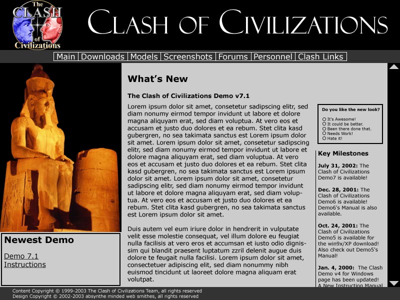
But seriously, I like pretty much everything about #1. My one issue is that a lot of screen real-estate is dedicated to the image at left. It makes a Great first impression, but after the 20th time it might get old.
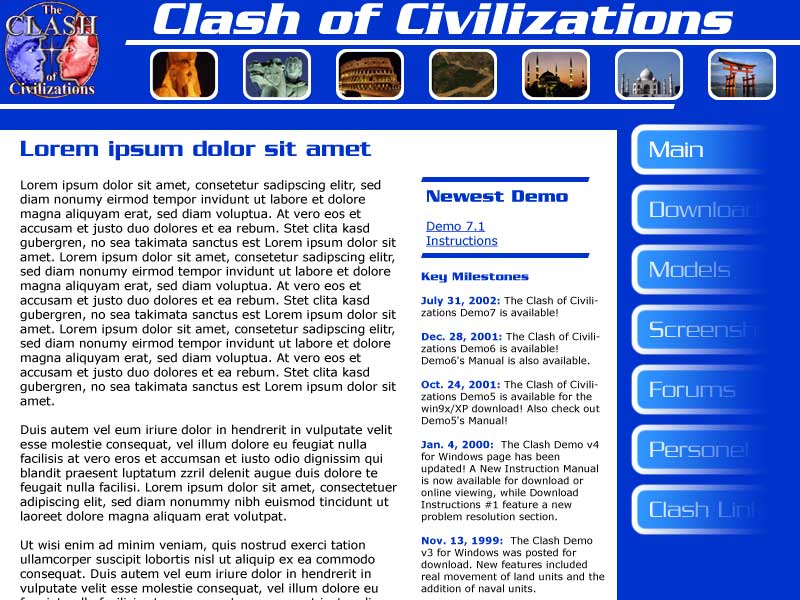
#2 is good in that it has a bit more screen dedicated to the real stuff. I also like the strip of thumbnails at the top. I think it'd be especially good if the thumbnails could be associated with the menu items in some contextual way, like "downloads" could show a computer, etc. Not sure if this latter is really a good idea, but in the spirit of brainstorming I thought I'd throw it out.
Thanks for doing them, I can tell already you're going to end up with something really great!
|
|
| |
|
|
|
LDiCesare
|
|
La Ferté sous Jouarre France
Jan 2001
time: 05:24
|
|
I prefer Design1 to Design2 because of the follwing in design2:
The buttons to the right are hard to read. The right of them is shaded, making it hard to read. I cannot focus on that part of the page.
I also don't understand at first glance what the little images mean. Are they here to be pretty or will I have to move my mouse and try to hover on top of them in order to uncover their mysterious purpose?
Last I don't like the blue colour much. It's a bit too saturated for my taste.
|
|
| |
|
|
|
chegitz guevara
|
 |
Ft. Lauderdale, FL Communist Party of Apolyton
Jun 2000
time: 00:24
|
|
quote:
Originally posted by Mark_Everson
Perhaps you should briefly respond to peoples' comments |
Okee dokee
quote:
But seriously, I like pretty much everything about #1. My one issue is that a lot of screen real-estate is dedicated to the image at left. It makes a Great first impression, but after the 20th time it might get old. |
I'm thinking that the image and area below it would be part of the text area, so that the whole thing is scrollable. The text will wrap around the bottom edge of the image/"pull-quote". The size of the image and "pull-quote" box can be fiddled with to get closer to the sweet-spot (twelve words or sixty characters).
I wouldn't want to have the entire are filled with text in any event. Text is actually easier to read in smaller columns, and electronic text needs all the help it can get.
quote:
#2 is good in that it has a bit more screen dedicated to the real stuff. I also like the strip of thumbnails at the top. I think it'd be especially good if the thumbnails could be associated with the menu items in some contextual way, like "downloads" could show a computer, etc. |
It's only accidental that the images on top match the number of buttons. They are simply for design purposes. They illustrate various cultures and also move forward in time (there was an image of the Abe Lincoln Memorial but it didn't fit). The design is kind of a flash/Japanese ultra-modern. The idea is to say that we're pushing the edge. After all--you're trying to create a powerful ai, which is something most game companies seem to have ignored.
Last edited by chegitz guevara on 02-01-2003 at 08:01
|
|
| |
|
|
|
LDiCesare
|
|
La Ferté sous Jouarre France
Jan 2001
time: 05:24
|
|
quote:
Originally posted by Gary Thomas
Record me as preferring #1.
Cheers
Gary Thomas |
Nice to hear from you again Gary!
|
|
| |
|
|
|
Richard Bruns
|
|
NC, USA
Nov 1999
time: 06:24
|
|
Not that it matters at this point, but I too like number 1. Bright web pages hurt my eyes, and, in my opinon, look less professional. The only problem I see with that design is that the picture on the left is pretty big and dominant, taking up a lot of space.
|
|
| |
All times are GMT. The time now is 05:24.
Apolyton Time is 00:24. |
top of page
|
|
|
Forum Rules:
You may not post new threads
You may not post replies
You may not post attachments
You may not edit your posts
|
HTML code is ON
vB code is ON
Smilies are ON
[IMG] code is ON
|
|
|
|
|
|





 21-12-2002 05:23


 Attachment:


 .
.





 |
|