Apolyton Archive  |  Preserved copy of the Apolyton Civilization Site and its forums as they stood in September 2005. Read-only; nothing here can be posted to or replied to.  |  Forum index |  About this archive |  The 1998–2001 UBB forums
Today on Apolyton WARDELL INTERVIEW PROMO A.C.S. HISTORY CHAPTER 4 GET CIV4 /w FREE PLUS! A.C.S. PHOTO GALLERY GET A.O.M. V1.1
Apolyton Civilization Forums
main| civ2| civ3| civ4| smac| ctp2| ron| moo3| galciv| galciv2| alt| about|
ApolytonPLUS | register | search | faq | new posts | pm (-/-) | upload | members
hall of fame new! | civgroups | civgroups news | interviews | the column | radio | chat | directory | news | store | PLUS
Apolyton Civilization Forums : Powered by vBulletin version 2.0.3 Apolyton Civilization Forums > Alternative Civs > Stella Polaris > GUI Design(s)
Show a Printable Version | Email This Page to Someone! | Receive updates to this thread | Report this to Apolyton news!

bottom of page
  
Author
Thread   
Pages (2): [ 1   2   ]
< Last Thread     Next Thread > Post New Thread     Post A Reply
Jeremy Buloch is offline Jeremy Buloch
Prince
Apparently on the computer
Jan 2002
time: 21:25
  Old Post 25-01-2003 02:18 Visit Jeremy Buloch's homepage!
Edit/Delete Message Reply w/Quote
#1 Report this post to a moderator
GUI Design(s) Tired of ads?

Here is my finished design of what the Main basic interface could look like and we can make it look different to accomadate the features we will be using. When the engine gets coded then we need a GUI so thats why I made it.
-J.B.-

Attachment: gui design stp main-text-colored-finished-1-24-03.zip
This has been downloaded 15 time(s).

Michiel is offline Michiel
Chieftain

Nov 2002
time: 05:25
  Old Post 25-01-2003 02:30
Edit/Delete Message Reply w/Quote
#2 Report this post to a moderator
Support Apolyton, buy Civilization III: Complete

I think we shouldn't put toolbars/frames/whateveryoucallits on the left or right side of the screen. I think only in the top and bottom of the screen would be best. And we'll have to make it usable for resolutions of 800x600 and up. Some part of the bottom part of the screen can have a different function for each 'unit', 'whatever' is selected. You wouldn't have to show everything at the same time. Maybe the player could modify the GUI him/herself.

Hehe, moddable GUI. I'm not sure, but I don't think it would be hard. Just use some sort of dockable windows. You know, if you wanted to, you could even let the unit-controll-panel float wherever you want. Or maybe remove a window if you don't use it. There will also have to be a chat-panel/screen for multi-player games, something you wouldn't allways want in the screen.

Just an idea.

Jeremy Buloch is offline Jeremy Buloch
Prince
Apparently on the computer
Jan 2002
time: 21:25
  Old Post 25-01-2003 02:37 Visit Jeremy Buloch's homepage!
Edit/Delete Message Reply w/Quote
#3 Report this post to a moderator
Support Apolyton, buy Civilization: The Boardgame

Yeah I get what your saying.
If we have close button on the top then it could close it and in the drop down menu we can have the option of putting them back on. Also The boxes could be moved around like windows and positioned however wanted. I like the Idea.
-J.B.-

DeathByTheSword is offline DeathByTheSword
King
soon to be a major religion
Nov 2001
time: 05:25
  Old Post 25-01-2003 02:43
Edit/Delete Message Reply w/Quote
#4 Report this post to a moderator
Support Apolyton, buy Galactic Civilizations

i wouldnt use a close button on the windows...but rather a fuction in options to remove add screens....i agree that the left and right needs to be clear of windows....and i would put the minimap or top left or top right....leave the bottom totally for info about current selection....and the topp for scrolldown menus and minimap....or make the minimap a scroll up/down thiny that if you hover over a bar the map scrolls down.....

Jeremy Buloch is offline Jeremy Buloch
Prince
Apparently on the computer
Jan 2002
time: 21:25
  Old Post 25-01-2003 02:50 Visit Jeremy Buloch's homepage!
Edit/Delete Message Reply w/Quote
#5 Report this post to a moderator
Support Apolyton, buy Civilization: The Boardgame

Hmmm ok I'll take that into consideration. I'll try to incorperate it into one nice little interface. Any more suggestions before I redesign the GUI?
-How about an option to have close buttons.
-J.B.-

Michiel is offline Michiel
Chieftain

Nov 2002
time: 05:25
  Old Post 25-01-2003 03:25
Edit/Delete Message Reply w/Quote
#6 Report this post to a moderator
Support Apolyton, pre-order Civilization IV

DBTS is right. Close buttons are ugly. Just use a set of checkboxes in the option-screen to turn screens on/off.

Jeremy Buloch is offline Jeremy Buloch
Prince
Apparently on the computer
Jan 2002
time: 21:25
  Old Post 25-01-2003 05:34 Visit Jeremy Buloch's homepage!
Edit/Delete Message Reply w/Quote
#7 Report this post to a moderator
Remove this text

OK here is the first design it is of The basic design with a hidden mini map and has all places labled.
-J.B.-

Attachment: stp revised gui design-main-text-1-24-03.zip
This has been downloaded 6 time(s).

Jeremy Buloch is offline Jeremy Buloch
Prince
Apparently on the computer
Jan 2002
time: 21:25
  Old Post 25-01-2003 05:35 Visit Jeremy Buloch's homepage!
Edit/Delete Message Reply w/Quote
#8 Report this post to a moderator
Support Apolyton, buy Alpha Centauri

Here is the second design of the minimap unhidden and not all labled.
-J.B.-

Attachment: stp revised gui design-main-text-minimap-1-24-03.zip
This has been downloaded 9 time(s).

vovan is offline vovan
Emperor

Oct 2001
time: 06:25
  Old Post 25-01-2003 06:55
Edit/Delete Message Reply w/Quote
#9 Report this post to a moderator
Support Apolyton, pre-order Civilization IV

Well, these look nice, but I, personally, have a rpoblem with movable windows. IMHO, the panes with information should be static. There should be at most one movable internal frame - minimap. Everything else has to be wired to the background, and possibly removable via checkboxes in the options menu.

The movable windows can be helpful and fun to move around for a little while, but soon they just become annoying (and, BTW, if moving windows inside the game is fun, well... you know, something is wrong with the game). If we make the bars you have to grab to move a window small, it will be a pain to actually move them, and nobody will use the feature. If we make them large, they will look ugly, cluttering the space, and people will accidentally move them in the process of the game, which would be very annoying. You have no idea how easy it is to accidentally move a movable window when you are all inside the game.

Just my $0,02 worth.

Jeremy Buloch is offline Jeremy Buloch
Prince
Apparently on the computer
Jan 2002
time: 21:25
  Old Post 25-01-2003 07:03 Visit Jeremy Buloch's homepage!
Edit/Delete Message Reply w/Quote
#10 Report this post to a moderator
Support Apolyton, pre-order Civilization IV

Hmmm well I think we should have movable windows and an option to have them non-movable. Civ. has movable windows and its never a problem with moving them. I'll wait for more feedback cause I dont want to make another tonight. Untill I'm convinced of doing something and the votes are more. So far its 3 against 1. Untill then its staying as it is.
-J.B.-

Jeremy Buloch is offline Jeremy Buloch
Prince
Apparently on the computer
Jan 2002
time: 21:25
  Old Post 25-01-2003 09:32 Visit Jeremy Buloch's homepage!
Edit/Delete Message Reply w/Quote
#11 Report this post to a moderator
Browse Apolyton AD-FREE

So the questions are:

1.) Should there be Close option?

2.) Should there be Close button?

3.) Should there be movable windows?

4.) Or should the movable windows be optional where you can turn it off or on at your own leisure?

-J.B.-

vovan is offline vovan
Emperor

Oct 2001
time: 06:25
  Old Post 25-01-2003 10:05
Edit/Delete Message Reply w/Quote
#12 Report this post to a moderator
Full PM-box? Change here!

Yep, these are the questions we need to decide, JB. Though some of them are mutually exclusive. 1 and 2, for instance. and 3 and 4. So, we should answer the questions in this order, I think:

1) Should the interface be absolutely static (i.e. no movable or closable windows), or should we allow the player some degree over the GUI?

2) If the latter, should we allow the player to choose which windows are open, and which are closed?

3) If yes, how should it be done - through options, of through buttons in the interface itself?

4) If we chose the latter option in question 1, should we alow the player to move windows inside the game or not?

vovan is offline vovan
Emperor

Oct 2001
time: 06:25
  Old Post 25-01-2003 10:06
Edit/Delete Message Reply w/Quote
#13 Report this post to a moderator
Support Apolyton buy from Amazon

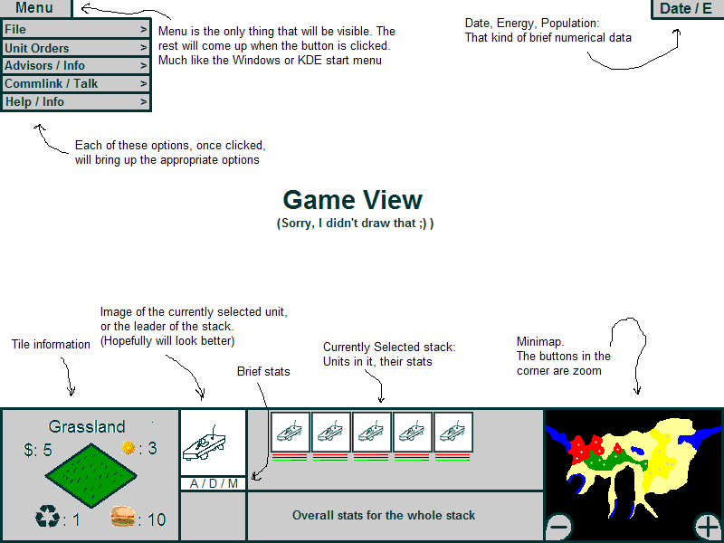
Also, I spent an hour or so with Paint, and came up with a little GUI layout of my own.

It assumes totally static layout though.

Attachment: stella gui vovan 20030125.gif
This has been downloaded 62 time(s).

Michiel is offline Michiel
Chieftain

Nov 2002
time: 05:25
  Old Post 25-01-2003 15:04
Edit/Delete Message Reply w/Quote
#14 Report this post to a moderator
Increase the size of your Attachments

I think the player should be able to move the windows..or change the entire GUI for that matter.. in the options screen. No close-buttons, drag-bars, they're all annoying. Off course, the windows must look as if they blend in with the background and each other, whatever combination you use. So each player can just make the GUI that's most comfortable for him/her.

BTW: I like the Warcraft 3 GUI. It should, however you modded it, still blend in like that. Of course, not with the same functions (like items), but it should be like that, maybe with that menu button in the top corner, but why not just make a whole menu-bar in the top, like in WC3.

DeathByTheSword is offline DeathByTheSword
King
soon to be a major religion
Nov 2001
time: 05:25
  Old Post 25-01-2003 15:31
Edit/Delete Message Reply w/Quote
#15 Report this post to a moderator
Support Apolyton, buy Civilization 2

well i dislike the ide of having eh WC3 interface because we need tile info....but i also dont like to civ/smac aproach vovasim used.....as far as i think we need a totally new GUI....if possible....with an option to remove windows but no to drag them or use X buttons on thw windows......

Leland is offline Leland
Prince

Jan 2000
time: 07:25
  Old Post 25-01-2003 16:57
Edit/Delete Message Reply w/Quote
#16 Report this post to a moderator
Support Apolyton, buy GURPS/ Alpha Centauri

Uh, wasn't it kind of agreed that there are no "tiles"? Hence, no tile info either.

vovan is offline vovan
Emperor

Oct 2001
time: 06:25
  Old Post 25-01-2003 21:03
Edit/Delete Message Reply w/Quote
#17 Report this post to a moderator
Got spare money?

quote:
Originally posted by Michiel
BTW: I like the Warcraft 3 GUI. It should, however you modded it, still blend in like that.


That is exactly the problem I have with dynamic GUI's. no matter what you do, and how pretty you make your interface, once the windows are moved around, it will not blend together creating the look of consistency, and will look rather ugly. (Unless, of course, you use the standard-looking windows frames inside, in which case, the interface won't be any uglier than at the start.)

Then, again, I'm all for a "a totally new GUI," though since I can't think of any, sorry if I am not much help in designing it...

Jeremy Buloch is offline Jeremy Buloch
Prince
Apparently on the computer
Jan 2002
time: 21:25
  Old Post 25-01-2003 23:54 Visit Jeremy Buloch's homepage!
Edit/Delete Message Reply w/Quote
#18 Report this post to a moderator
Inflate your Upload Space

Ok after careful thinking I post:

First of all when we talk about the close options, well we cannot include options in a design it just wouldn't look right. We can of course specify them but to draw an option isn't a benefical use of time. We will design the option menu later. As well as other GUI's after the basic one is complete.
The Color or way of making it pretty isn't at debate right now. We need to focus on having a GUI rather than making it pretty. We can worry about that once we have a basic GUI to test the game with.

I will create another interface since I have a few Ideas in mind, but first I will need several questions answered. Oh and plz put the number then answer:

1.) Where should the windows be?

2.)Close, an Option?

3.)Drag windows with no Option?

4.) If 3 then Do we use bars to drag or just any part of the window that is applicable.

5.) Drag, an Option? The user would like this if he/she were to not like the idea of movable windows.

6.) MiniMap Hidden?

7.) Menu Across screen or in one button possibly close to the minimap etc.?

P.S. The user wants the interface to be simple, fast, neat, and compact. The Windows cant get the users attention too much cause the user would be concentrated on the game not on the Interface.
-Just some stuff to think about.
-J.B.-

Michiel is offline Michiel
Chieftain

Nov 2002
time: 05:25
  Old Post 26-01-2003 01:18
Edit/Delete Message Reply w/Quote
#19 Report this post to a moderator
Remove this text

Ok.

1:
Wherever the player wants them. Floating in the screen, or docked at the edge of the screen. Whichever edge the player wants. Or closed = not on the screen at all.

2:
No close buttons, in my opinion. In the options menu, there should be a 'tab' named Windows, or Panels, or whatever. In that screen you can add/remove/replace windows in a small model. When you click OK, you will apply that GUI to the real game. Maybe you can also make hotkeys to change GUI in an instant.

3:
No, like I said with 2. It should all be in a menu.

4:
X

5:
As I said in 2. All in a menu.

6:
The minimap should be just another window that the player can add/remove/replace in the menu. This is where hotkeys mainly come in handy. To quickly open/close the minimap.

7:
Not one button. Just make them across the screen on the top of the screen. That's my opinion but I don't really care.

---
I think this would make for a perfect GUI. As for blending in the windows (That's the 'make it pretty' part). I think we can use 'images' as borders/sides of the windows. Images that change when that side is docked with another window or the screen. I don't think that would be a problem. Maybe we can also make skins for the game.. Well, it shouldn't be a priority.

Jeremy Buloch is offline Jeremy Buloch
Prince
Apparently on the computer
Jan 2002
time: 21:25
  Old Post 26-01-2003 01:42 Visit Jeremy Buloch's homepage!
Edit/Delete Message Reply w/Quote
#20 Report this post to a moderator
Get a bigger avatar today!

About the Hybrid Design...

We could have the default style put. Then we can let the user define what type of style he/she wants. The user should be able to drag drop windows to whatever position and etc. Or the user could pick from a list of already drawn designs and use them. So one user could pick the left side windows or another one could pick top Windows or bottom windows. You get my drift...
The default is what we will need to discuss first. Then after we have a working basic game to play around with we can make the other designs.

-Just another Idea...
-J.B.-

Michiel is offline Michiel
Chieftain

Nov 2002
time: 05:25
  Old Post 26-01-2003 03:48
Edit/Delete Message Reply w/Quote
#21 Report this post to a moderator
Support Apolyton, buy Alpha Centauri

Well I think what we need to do first is make the moddable GUI, like the answers I gave to your questions. (I hope ) Then decide on a default GUI and put it into the game with a default name. It would be foolish to first make a normal/everyday/static GUI and later alter the entire code to make it moddable. Maybe later we could add some other defaults the player can choose from, and maybe he/she can create one himself and put it in the list of GUI's. And I still think they should be able to be called by a hotkey.

And first we can make an ugly GUI. Like you said, the nice borders can come later. Even skins. I could create a GUI-skin. Maybe tomorrow I'll make one so you get my idea.

Jeremy Buloch is offline Jeremy Buloch
Prince
Apparently on the computer
Jan 2002
time: 21:25
  Old Post 26-01-2003 04:25 Visit Jeremy Buloch's homepage!
Edit/Delete Message Reply w/Quote
#22 Report this post to a moderator
Support Apolyton buy from Amazon

Ok I see, Well I'll start making a GUI soon. I'm impatient and just want to post some Ideas I have. Still Post some answers please. The more I get the better it'll be!
-J.B.-

Jeremy Buloch is offline Jeremy Buloch
Prince
Apparently on the computer
Jan 2002
time: 21:25
  Old Post 26-01-2003 05:37 Visit Jeremy Buloch's homepage!
Edit/Delete Message Reply w/Quote
#23 Report this post to a moderator
Enter the AD-FREE zone

Ok here is a new GUI I attached the same one downloading it and then looking will make it look better.
-J.B.-

Jeremy Buloch is offline Jeremy Buloch
Prince
Apparently on the computer
Jan 2002
time: 21:25
  Old Post 26-01-2003 05:42 Visit Jeremy Buloch's homepage!
Edit/Delete Message Reply w/Quote
#24 Report this post to a moderator
Remove this text

The last attachment messed up so here it is again.
-J.B.-

Attachment: stp gui design v.0.2.zip
This has been downloaded 5 time(s).

Leland is offline Leland
Prince

Jan 2000
time: 07:25
  Old Post 26-01-2003 07:33
Edit/Delete Message Reply w/Quote
#25 Report this post to a moderator
Inflate your Upload Space

My gut feeling (which may of course be utterly wrong) about coding a moddable GUI is that if everything is done in nice, object-oriented fashion then there is no serious rewriting necessary even if you start with a static GUI and plan on adding moddability later. Basically the thing just means that instead of hard-coded values you just load the positions, sizes, textures, etc. from a file, right? So in the first alphas where the priority is to get something out the door moddability can be considered secondary.

vovan is offline vovan
Emperor

Oct 2001
time: 06:25
  Old Post 26-01-2003 07:55
Edit/Delete Message Reply w/Quote
#26 Report this post to a moderator
Browse Apolyton AD-FREE

Well, I am the only person here with the opinion that the GUI should be static, but I will answer the questions nonetheless.

quote:
Originally posted by Jeremy Buloch
1.) Where should the windows be?


In the bottom of the screen. Or on a side. In my opinion, if more than one side of the game widow is taken up by information / manipulation panels, that takes up too much of the game view, and the player feels claustrophobic (sp?).

quote:

2.)Close, an Option?


Yes. Through the options panel, not through actual buttons visible at all times.

quote:

3.)Drag windows with no Option?


No drag.

quote:

4.) If 3 then Do we use bars to drag or just any part of the window that is applicable.


Well, if 3, then any part probably. But it would be nice that if the player clicks a button and drags the mouse the window would not move. I don't know about other people, but when I play, and am all excited, I tend to hurry a little bit, and start moving the mouse away from a GUI component before releasing the button. Therefore, I would have very bad problems with the window being movable by clicking on any part of it.

quote:

5.) Drag, an Option? The user would like this if he/she were to not like the idea of movable windows.


By all means. If we choose dragging to be in the game, it should be an option (probably not for the minimap, which could remain draggable at all times, but everything else - absolutely.)

quote:

6.) MiniMap Hidden?


Yes. I actually like the idea of being able to hide minimap.

quote:

7.) Menu Across screen or in one button possibly close to the minimap etc.?


One button gets my vote.

quote:

P.S. The user wants the interface to be simple, fast, neat, and compact. The Windows cant get the users attention too much cause the user would be concentrated on the game not on the Interface.


Well, that's kind of why I would prefer a streamlined, but static interface over a dynamic one. But hey, I am ready to go with whatever the majority wants.

PS: JB, I actually like your latest edition of the GUI more than the previous ones. I think it's starting to shape up nicely, if we can say so about little drawings.

Jeremy Buloch is offline Jeremy Buloch
Prince
Apparently on the computer
Jan 2002
time: 21:25
  Old Post 26-01-2003 08:02 Visit Jeremy Buloch's homepage!
Edit/Delete Message Reply w/Quote
#27 Report this post to a moderator
Got spare money?

quote:
I don't know about other people, but when I play, and am all excited, I tend to hurry a little bit, and start moving the mouse away from a GUI component before releasing the button. Therefore, I would have very bad problems with the window being movable by clicking on any part of it.


LOL yeah I have this sort of problem too. I get impatient sometimes and click fast when I've seen a scene already. Then I drag the mouse to another spot for it not to do anything wrong. I had some of my friends vote and they said a movable GUI will be irritible but with an option then it is good.

P.S. Thanks Vovansim. Last one I didn't use Paint.
-J.B.-

Michiel is offline Michiel
Chieftain

Nov 2002
time: 05:25
  Old Post 26-01-2003 14:04
Edit/Delete Message Reply w/Quote
#28 Report this post to a moderator
Help yourself to an AD-FREE life

Nope, and the Word-GUI's look just as good.

Gateway103 is offline Gateway103
Chieftain

Jul 2002
time: 21:25
  Old Post 27-01-2003 00:19
Edit/Delete Message Reply w/Quote
#29 Report this post to a moderator
Put an end to popups!

Vovanism, have you seen the MOO3 GUI's? The Apolyton has some screenies of them in their moo3 sections. I like MOO3's GUI design, and by your preference to static GUIs, you may like it too.

Others are of course welcome to take a look for ideas

P.S. there is also a more in-depth Developer's Diary on Gamespy regarding the design philosophy of MOO3's GUI, which I think contained some valid and important ideas on GUI design. The link is: http://www.gamespy.com/devdiary/june01/moo39/

Just a thought

-Gateway103

vovan is offline vovan
Emperor

Oct 2001
time: 06:25
  Old Post 27-01-2003 02:54
Edit/Delete Message Reply w/Quote
#30 Report this post to a moderator
Suffering from ads?

Thanks for the link, Gateway, I think the article does touch on many important points and would be very beneficial to read for the person in charge of the GUI. (JB, I suppose.)

 
Pages (2): [ 1   2   ]
< Last Thread     Next Thread > Post New Thread     Post A Reply
All times are GMT. The time now is 05:25.
Apolyton Time is 00:25.
    top of page
Rate This Thread:
Forum Jump:
Forum Rules:
You may not post new threads
You may not post replies
You may not post attachments
You may not edit your posts
HTML code is ON
vB code is ON
Smilies are ON
[IMG] code is ON


Contact Us - Apolyton Civilization Site - Support Us!

Building a better Apolyton through better information. Click here and take our poll!
Non-US visitors, click here!

Powered by: vBulletin Version 2.0.3
Copyright ©2000, 2001, Jelsoft Enterprises Limited.

Page generated in 0.0680 seconds (93.39% PHP - 6.61% MySQL) with 30 queries
Page Loading Time:

Support Apolyton: Amazon USA | Amazon UK | Amazon DE | Amazon FR |
Support Apolyton and get FREE PLUS, Buy from Chips&Bits: Galactic Civilizations | Galactic Civilizations: Deluxe Edition | Call to Power 2 | Civilization: The Boardgame | GURPS/ Alpha Centauri | Alpha Centauri | Civilization IV | Civilization III: Complete |


Front Page | Civilization IV | Civilization III | Civilization II | Call to Power II | Alpha Centauri | Master of Orion III
Rise of Nations | Galactic Civilizations | Galactic Civilizations II | Misc
Alt.Civs | Civ I | C:CtP I | About | News | Directory | Apolyton Store | Forums | Chat | Columns | Interviews | Newsletter
Scenario League | CSC | Clash of Civs | Spanish Site | CtP Maps | Cradle of Civ | WesW's Ctp1/2 Site | Civ3 Haven

apolyton.net | apolyton.com | civilization2.net | civilization3.net | civilization4.net | civilizationiv.info | calltopower.net | galciv.net | galciv2.net | moo3.net