|

|
axi
|
 |
Athens Greece
Sep 1999
time: 07:17
|
|
Hmm, personally I don't like Gar's tin so much. I still insist that for minerals, the element name should be provided, inside a bullion of different color and/or shape.
Zn, Fe, Cu, Au at least should have letters on them, because distinguishing the bullions alone is difficult.
As for horses, I would suggest placing just a black horse's head on the map, which is easy to make and distinguishable.
At this point, functionality comes above prettiness.
|
|
| |
|
|
|
Gar
|
|
Axi,
Maybe you can explain what you are thinking? I can't see how a bar of a metallic color with element letters will be more recognizeable/useful than a graphic which attempts to convey an object made of the material representing the letter for the first name of the resource as needed.
quote:
At this point, functionality comes above prettiness. |
Can you help me understand what this means?
Gary,
I am toying around with more graphics and will have additions tomorrow with 120 x 60 graphics. How is it best I get these to you? Put them on my site or?
|
|
| |
|
|
|
Mark_Everson
|
 |
Canton, MI
Jan 1970
time: 00:17
|
|
Hi All:
quote:
The tiles are all 120x60, which the program rescales to 80x40. I am not certain why this is - it was in the code I inherited. |
My old code, as in demo 4, used 120x60 tiles that were zoomed in the code to become any of a variety of sizes, one of which was 80x40. If we don't end up using the 120x60 size for anything, we should do things going forward in the resolution in which it will be shown to the player since the quality of what the player sees will then be vastly improved. Now that the xml image specification is in there, it would be relatively easy to put in a tag that says if an image is based on 120 width or 80-width graphics. We could then slowly migrate to the preferred size using mixed tiles for the next several demos. Does this make sense to everyone? Gary, how much work would it be? Seems not much to me, but you're the one there on the ground.
The bullion-with-chemical-symbol doesn't do anything for me either, why are you insisting Axi? I realize that using T for tin is Anglocentric, but using Fe for iron will mean absolutely nothing to anyone who hasn't taken chemistry... I also think the ingots will say a little more to the player than a pile of bullion, YMMV.
Gar, I checked out your demo site again and saw the dress and horse images. If you were just trying out sizing and aren't worried about refinements yet then you can ignore what's below. As they are, I think they would gain from more color and highlights. FE Fiera did a pretty credible horse as part of the chariot icon that you might want to take a look at.
|
|
| |
|
|
|
Gar
|
|
I'll go back and revisit the images with more highlights and try the horse model rotated more when I render it. I've also realized I had the output scaling goofed in my renderer such that the widths of the images are 75% of what they should be. I will look for what Fiera had on a horse. But I haven't been freehand sketching these, and the horse 3d model is pretty robust just need to nail the coloration and rotation I think.
Ah, the anglo-centric comment! Got it. I missed the whole internationalization angle. I'll try to factor that in.
|
|
| |
|
|
|
colorrr
|
|
The tin looks really nice.
I like better using only one tin can, instead of forming a T with several of them, the tin can details get lost when the cans are so small. If the letters are desired, maybe it would be better to just use normal letters with the color being the same as the resource color.
I also think the image is a little too dominant in the map square. Could it be smaller?
Dunno if my opinions will make any difference, I get the impression you guys already finished these discussions.
|
|
| |
|
| |
|
|
|
Gar
|
|
I've just updated the site with new images.
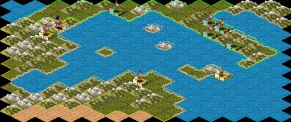
When something works, it really works. I tried out Gary's suggestion about Mines, and I'm convinced. I have a hard time imagining doing anything else, now. They work for immersion, I think the colored lumps are recognizeable enough. Now the challenge for the non-animal ones will be to make other images that integrate into the map.
I've made useable 120x60s of these linked on the site, and introduced naming convention. The resource files are named:
RES_resourcename.gif
After wandering through the JAR file, thinking similar conventions might be useful for all other graphics?
Now my mind is churning for other resources...
Metalworks - a smithy
Cloth - A loom and/or spinning wheel
Salt - a dry lake bed type salt mine with a pile of salt (may add this tonight)
I'll wait on the other two, but dying to see if I can make the salt one look right.
|
|
| |
|
|
|
colorrr
|
|
The mine entrances look much better!
I like the idea of distinguishing between the mines with different coloured lumps outside it.
How about making an icon like the a mine entrance? You know, two horizontal wooden poles with one wooden pole above, and coloring the opening with the color of the metal. That would make the difference between various metal stand out more, but the concept (mine) would still be recognizeable. Another idea would be to fill the entrance with bigger lumps of the metal.
The gold medallion I did not like, maybe just a mine with gold would be better.
Another idea is having a spoon like the ones used in forgerys to contain melted metal that is poured down into a pool. The pool and the metal flow would have the color that differentiates the different metals.
Color
|
|
| |
|
|
|
Gar
|
|
I tried to go back as primitive as I could on these, which is why I skipped even the classic wooden beam mine entrance part. There is in general something to maintaining the visual integrity of the map.
I may have been overly convinced. One key piece of data I'm missing is the relative density of resources; as in, what percent of squares will have a special resource? This is important, imo, in what sort of graphics is needed.
Also, is fog of war an overlay or does that need two versions of a resources (dark & light) or will resources remain bright in fog areas?
Once I know the density I will put together a map screen with resources distributed to how it looks, or these could roll into a demo?
Still wide open to arguments any way, and I don't mind trying various variations.
|
|
| |
|
|
|
Gary Thomas
|
 |
New Zealand
Mar 2001
time: 17:17
|
|
Mark:
quote:
I consider needing to click on a square to see which type of mined resource is present to be unacceptable. |
Unacceptable requires the specification of an acceptable alternative. Do you have one? Anyway it doesn't matter because Gar's mines are pretty good.
quote:
There are certainly alternatives, like having a resource locator |
I will code this today.
quote:
While I think the mine-with-lumps concept might work, IMO the present demo versions from your web site at 80x40 will be virtually indistinguishable once put on a map with different colors and units on it. |
They seem pretty clear to me, and much more identifiable than the military units.
colorr:
quote:
The mine entrances look much better! |
I agree.
quote:
Another idea is having a spoon like the ones used in forgerys to contain melted metal that is poured down into a pool. The pool and the metal flow would have the color that differentiates the different metals. |
This is a way to identify processing plants, not the source of the ore.
Gar:
quote:
One key piece of data I'm missing is the relative density of resources; as in, what percent of squares will have a special resource? This is important, imo, in what sort of graphics is needed. |
This is critical information which only Mark can provide.
quote:
Also, is fog of war an overlay or does that need two versions of a resources (dark & light) or will resources remain bright in fog areas? |
The fog of war is implemented by dulling the colour in the final map square, including all known characteristics such as cities and resources (but not units, which are not seen).
I would imagine that a square has to be prospected in some way to discover whether resources are present, but I am unaware of any discussion on this issue.
Axi:
quote:
You can see gold, iron, copper, coal and uranium in some of sas's tiles. |
Now we need the Chinese, Japanese, Korean, Thai, Hindi, Arabic, Russian and Greek versions please.
Cheers
|
|
| |
|
|
|
Mark_Everson
|
|
Canton, MI
Jan 1970
time: 00:17
|
|
quote:
Originally posted by Gar
One key piece of data I'm missing is the relative density of resources; as in, what percent of squares will have a special resource? This is important, imo, in what sort of graphics is needed. |
Hi Gar, my expectation is that specials would be between 5 and 10% of tiles. But that could change on the upside depending on playtesting. I would not rule it out that every square could have its special at this point, though I think its not likely.
quote:
The chemical symbols are used internationally! |
Axi, there are lots of thing used internationally by specialist communities. That doesn't make them suitable for a game played by everyday people.
quote:
They seem pretty clear to me, and much more identifiable than the military units. |
Wow, Gary, our perceptions must differ Radically. The military units each have a unique shape and mixture of colors. The mine ones have a few dabs of different shades on them. I can't remember which game, but something I've played had similar resource icons to the ones proposed. I was forever cursing and squinting at the map to see what the h*ll that particular one was. I have Never had that problem with our units icons, and don't forsee that happening as their number increases.
But anyway there are proposals available that put a much larger swath of the descriptive color on the icons, which should be sufficient. Since the icons can be swapped out using the xml file, if I'm the only one that's unhappy, I can use Axi's or another alternative set with relative ease! 
quote:
This is a way to identify processing plants, not the source of the ore. |
Just for the record, I currently have no plans for processing plants for metals. But I guess since the econ framework allows two-step industries (or even n-step processing industries) we should avoid processing-based icons for ores if possible.
quote:
I would imagine that a square has to be prospected in some way to discover whether resources are present, but I am unaware of any discussion on this issue. |
There has already been some discussion. Probably its in an old map-creation thread. But I would like to ignore the issue for quite some time if possible. 
|
|
| |
|
|
|
Gary Thomas
|
|
New Zealand
Mar 2001
time: 17:17
|
|
quote:
The chemical symbols are used internationally! |
They may be used internationally, but are they understood internationally? Perhaps 5% of the world's population knows that Au means gold. About 90% knows it comes out of the ground and is yellow.
Which chemical symbol would you use for oil? Or even salt? Or marble or amber (both important export products in ancient times)? Or diamond (which is different from charcoal)?
quote:
The military units each have a unique shape and mixture of colors. |
No they don't, elements have images, and they are not unique. I never quite know what a particular unit symbol is going to be and always have to click on the square to get the information from the task force frame. To be blunt, I would be hugely happier if the images were a characteristic of the unit rather than the elements. There is no reason why this should not be the case, simplifying code and giving a much clearer message to the player.
In any case we have far too few unit incons to make them very useful at present.
quote:
There has already been some discussion. Probably its in an old map-creation thread. But I would like to ignore the issue for quite some time if possible. |
Does this mean they should all be visible? That's OK, now I have to find out how they are recorded, if they are recorded, so I can put them in the scenario file and then display them.
Last edited by Gary Thomas on 03-04-2002 at 08:41
|
|
| |
|
|
|
RM
|
|
Uppsala, Sweden
Sep 1999
time: 05:17
|
|
I think the resource map mentioned by Mark in an earlier post is a good idea. It would help to keep the ordinary map clean, and still have large and clear resource icons. The resource map does not have to account for fog of war either, since resources do not move around.
The resource panel could also contain a panel with explanations of the various icons (which would be almost necessary if you choose to use the chemical symbols, but could also be helpful if you use graphical icons).
|
|
| |
|
|
|
LDiCesare
|
|
La Ferté sous Jouarre France
Jan 2001
time: 05:17
|
|
Che, the number of tiles is not limited. (Although that looks great, you must understand it costs performance, but I don't think it is a bottleneck) I don't know how overlay things are handled to be honest, but knowing how graphics are integrated, you can add as many as you want to.
For walls in ancient times we could have two or three walls: wooden, (packed earth and wood,) stone wall. The middle one is optional. Depending on geography, I think different walls were used (more bricks in dry warm countries, mixed stone and wood in Gaul). Having two graphics for such an intermediate wall would probably be too much in terms of detail.
|
|
| |
All times are GMT. The time now is 05:17.
Apolyton Time is 00:17. |
top of page
|
|
|
Forum Rules:
You may not post new threads
You may not post replies
You may not post attachments
You may not edit your posts
|
HTML code is ON
vB code is ON
Smilies are ON
[IMG] code is ON
|
|
|
|
|
|





 01-04-2002 04:09


 Attachment:

 |
|