|
| |
|
|
GoPostal
|
That's the one. I find it so much easier to skip the help files and exhaustively try evrything.
|
|
| |
|
| |
|
Catfish
|
Wollongong, Australia
Aug 2000
time: 14:37
|
|
quote:
Originally posted by fairline
Yes, I was intending to redo a couple of ToT tanks with this palette. Obviously on reducing to 256-colours I would still have the same problem of not enough shades per hue. |
Calling it a 256-colour palette is actually a little flattering when you consider that you can only use 192 of them! 
quote:
Originally posted by fairline
Funnily enough I've moved away from a 'subtle' approach as regards shading towards a higher contrast look, as you can see from the Russian tanks I've been posting, which have fairly large steps between shades. However, it won't hurt to give this a go, and I'm still not convinced the 'high-contrast' look is all that good. |
So as I don't find myself talking out of my arse, I took another look at your new German and Russian tank series to freshen my memory. On second opinion, I even find some of the standard Russian versions (body, as well as tracks) a touch high in contrast, but this is just personal taste. However, I'm certain some of the German vehicles suffer more in this respect. Having said that, from a technical standpoint they're clearly superior to anything anyone's produced to date.
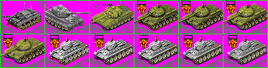
I'll try to explain myself with examples, so I've attached a few tanks below for reference. In my view, a good example of high-contrast graininess is the StuG III – the hull, wheels and the tracks. I think perhaps the contrast between the wheels and the hull should be reduced. For comparison I've got your modified version of Nemo's Tiger II and I think this one just about gets it right. The Nemo tracks mightn't be perfect, but they don't detract; IMHO the contrast and shading on the turret, hull and details are spot on (for 8-bit).
For the new Russian tanks: you mentioned the winter versions, but as I said, I believe that the standard ones are also a touch high in contrast. The tracks are grainy on all versions. IMHO, the best example of one of your high detail tanks is your older T-90. You've added all sorts of bits and pieces to the hull and turret, but you've nailed the contrast perfectly (it's possibly my favourite of all your tanks). It almost looks a little washed out when juxtaposed to the JS-3, but that'd be my standard.
I guess I'd better put my money where my mouth is and offer some alternatives. The numbers below correspond to various versions of the attached JS-3 and T-34.
1. The original JS-3.
2. Manually changed the style of the tracks to something similar to that of the Tiger II shown, although I'm sure that can be improved. Replaced the black hull section around the wheels (whatever that's called) with a shade of grey. Tweaked the shadow shape and changed the colour – I'm not keen on brown shadows.
3. Selected the hull and turret only. Increased colour depth to 24-bit. Used <B>Brightness/Contrast</B> with the settings, Brightness 10, Contrast -10. This produced a slightly washed out look, so I needed to increase the colour saturation again. You could use <B>Hue/Saturation/Lightness…</B>, but I just passed the <B>Saturation Up/Down</B> retouch brush over the selection a couple of times with whatever settings I just happened to have at the time. These were: Size 40, Hardness 100, Step 1, Density 100, Opacity 24. I then reloaded the Civ2 palette.
4. The same as 3, except the settings were Brightness 10, Contrast -20.
5. The original winter T-34.
6. The tracks and shadow have been modified in the same manner as for the JS-3.
7. Hull, turret and wheels modified using Contrast -10.
8. Contrast -20.
9. Contrast -30.
I didn't spend too much time experimenting with my settings, but really I just wanted to help illustrate whether or not a lower contrast on the body and tracks is an improvement, and if so what kind of level is optimal. Opinion?
I imagine something like the StuG III would require a bit of manual work, since lowering the contrast doesn't actually add any shading steps (which is possibly what it requires) – in this respect, the JS-3 and T-34 are superior. Possibly reducing the contrast between the wheels and the hull might be an improvement (make the hull something like #232323, instead of black).
quote:
Originally posted by fairline
I was a little unsure of them myself, particularly the white winterised versions - I definitely overdid the contrast setting after greyscaling. Should I get rid of the tracks altogether or just redo with darker less-contrasting colours? |
I'd keep them and redo with less contrasting colours (darker for the winterised versions, not necessarily so for the others). Hopefully, I've been of some help.
 Attachment: fairlinetanks.gif Attachment: fairlinetanks.gif
This has been downloaded 272 time(s).
Last edited by Catfish on 14-12-2003 at 05:08
|
|
| |
|
Catfish
|
Wollongong, Australia
Aug 2000
time: 14:37
|
|
Those re-tracks were originally for my own benefit - I didn't intend to post them. Then I figured that they might be useful.
I looked at the new winter KV-1 and I still prefer lower contrast tracks, but then again I've been accused in the past of making my units too blurry, so what do I know? 
Last edited by Catfish on 16-12-2003 at 03:31
|
|
| |
|
Catfish
|
Wollongong, Australia
Aug 2000
time: 14:37
|
|
It's a long time to wait, just for this:
Attachment: merkava mk1.gif
This has been downloaded 166 time(s).
|
|
| |
|
| |
All times are GMT. The time now is 05:37.
Apolyton Time is 00:37. |
top of page
|
| |
|
|
|
|

 |
Amazon
UK
|
Amazon
UK |
Amazon DE |
Amazon FR |
|
Amazon DE |
Amazon FR |






 I'll give this a try. Funnily enough I've moved away from a 'subtle' approach as regards shading towards a higher contrast look, as you can see from the Russian tanks I've been posting, which have fairly large steps between shades. However, it won't hurt to give this a go, and I'm still not convinced the 'high-contrast' look is all that good. In fact, other than grey or fawn units, there just aren't enough shades per hue in the civ palette and I have to move from one colour to another to get the range I'm looking for (for example the olive greens to dark fawn browns for these Russian tanks); this 256 range of shades will definitely help in that respect.


 Attachment: