Apolyton Archive  |  Preserved copy of the Apolyton Civilization Site and its forums as they stood in September 2005. Read-only; nothing here can be posted to or replied to.  |  Forum index |  About this archive |  The 1998–2001 UBB forums
Today on Apolyton WARDELL INTERVIEW PROMO A.C.S. HISTORY CHAPTER 4 GET CIV4 /w FREE PLUS! A.C.S. PHOTO GALLERY GET A.O.M. V1.1
Apolyton Civilization Forums
main| civ2| civ3| civ4| smac| ctp2| ron| moo3| galciv| galciv2| alt| about|
ApolytonPLUS | register | search | faq | new posts | pm (-/-) | upload | members
hall of fame new! | civgroups | civgroups news | interviews | the column | radio | chat | directory | news | store | PLUS
Apolyton Civilization Forums : Powered by vBulletin version 2.0.3 Apolyton Civilization Forums > Call To Power II > CtP2-Source Code Project > GRAPHICS: Call to Artists!
Show a Printable Version | Email This Page to Someone! | Receive updates to this thread | Report this to Apolyton news!
CivGroups
CTP2 Source Code Project (59): Not a Member - Join

bottom of page
  
Author
Thread   
Pages (10): [ <<   5   6   7   8   9   10   ]
< Last Thread     Next Thread > Post New Thread     Post A Reply
Maquiladora is offline Maquiladora
Emperor

Jun 2001
time: 05:34
  Old Post 21-04-2004 10:06 Visit Maquiladora's homepage!
Edit/Delete Message Reply w/Quote
#211 Report this post to a moderator
Support Apolyton buy from Amazon

My only problem with the vanilla screens is that i cant see the effect on production speed when im changing specialists in City Manager, without closing the City Manager first, so anything that fixes that would be good. When you change the Empire Manager you can see the advance count going up or down, so why cant you see the production for a city updated as you change specialists?

Anyway if there HAS to be a whole new design, id like to see a "NEXT POP IN [ ] TURNS".

Peter Triggs is offline Peter Triggs
Prince
Gone Fishin, Canada
Jan 2000
time: 05:34
  Old Post 21-04-2004 13:00
Edit/Delete Message Reply w/Quote
#212 Report this post to a moderator
Support Apolyton, buy Galactic Civilizations: Deluxe Edition

quote:

Anyway if there HAS to be a whole new design, id like to see a "NEXT POP IN [ ] TURNS".


It may be possible to do this (also) on the main screen by adding a little box under the city's pop. You'd have to have "Show city names" in your profile enabled to see it.

One point I'd like to raise is about the max army size. I think we could raise it providing we allow enough buttons for each of the possible units in the army. What do people think?

Gilgamensch is offline Gilgamensch
King
France
Jun 2002
time: 06:34
  Old Post 21-04-2004 13:08
Edit/Delete Message Reply w/Quote
#213 Report this post to a moderator
Remove this text

Locutus, the design is looking good, but I don't like that you have to scroll through the build list:

For me the build list shall have all entries visible. That is one of the biggest annoyances for me.

And as Maq mentioned:

quote:
My only problem with the vanilla screens is that i cant see the effect on production speed when im changing specialists in City Manager, without closing the City Manager first, so anything that fixes that would be good. When you change the Empire Manager you can see the advance count going up or down, so why cant you see the production for a city updated as you change specialists?

J Bytheway is offline J Bytheway
Emperor
England
Jul 2001
time: 05:34
  Old Post 21-04-2004 13:09 Visit J Bytheway's homepage!
Edit/Delete Message Reply w/Quote
#214 Report this post to a moderator
Support Apolyton, buy Galactic Civilizations

quote:
Originally posted by Flinx
The problem I have with this setup (which is based on The second layout by Locutus) is that the information on the left is so chopped-up and all over the place that it is impossible to use and this information is why I use the city screen!


I agree that it's not in the best possible arrangement, but I think if it's switched around some it will be no worse than the existing system. It might be a little harder to take in at a glance, but I think it's only a matter of getting used to it.

quote:
Originally posted by OnePresent
As I put this together another option came to mind that may be a better use of the tabs. Instead of having tabs for status and build, have tabs for build and map view. When is the map view least needed??? Maybe when using the build interface??


I don't think so... I think users are just as likely to want to see their city when choosing what to build (Does it need defence because it's near the enemy, does it need to build settlers because there's an area empty of cities nearby, etc.)

Here's a more ambitiious proposal: How about having two sections of the screen (basically where you have the map view and where you have the tabbed section in your last proposal) each of which can be chosen to be either build view, status view or see-through-to-map view.

Maquiladora is offline Maquiladora
Emperor

Jun 2001
time: 05:34
  Old Post 21-04-2004 13:53 Visit Maquiladora's homepage!
Edit/Delete Message Reply w/Quote
#215 Report this post to a moderator
Support Apolyton, buy Call to Power 2

quote:
It may be possible to do this (also) on the main screen by adding a little box under the city's pop. You'd have to have "Show city names" in your profile enabled to see it.


This is interesting. Can we have other things like currently building item and time to completion next to it, under the city name on the map too?

The Big Mc is offline The Big Mc
King
Of the universe / England
Oct 2001
time: 05:34
  Old Post 21-04-2004 15:19 Visit The Big Mc's homepage!
Edit/Delete Message Reply w/Quote
#216 Report this post to a moderator
Support Apolyton, pre-order Civilization IV

How about Time to next pop and a button to stagnate the pop growth.

Tamerlin is offline Tamerlin
King
Toulouse (South-western France)
Apr 2002
time: 06:34
  Old Post 21-04-2004 15:52
Edit/Delete Message Reply w/Quote
#217 Report this post to a moderator
Tired of ads?

quote:
Originally posted by OnePresent
As I put this together another option came to mind that may be a better use of the tabs. Instead of having tabs for status and build, have tabs for build and map view. When is the map view least needed??? Maybe when using the build interface??


True!

Though J Bytheway is not wrong neither...

I prefer the city screen you posted page 18, it seems to hold all the needed informations. I guess the problem is that it can't be displayed in 800x600...

Gilgamensch is offline Gilgamensch
King
France
Jun 2002
time: 06:34
  Old Post 21-04-2004 15:57
Edit/Delete Message Reply w/Quote
#218 Report this post to a moderator
Avatar Enlargement: We've got the solution

quote:
Originally posted by Tamerlin
I prefer the city screen you posted page 18, it seems to hold all the needed informations. I guess the problem is that it can't be displayed in 800x600...


Page 18 ?????????????????????

Locutus is offline Locutus
ACS CTP1/2 Manager & Civ4 Co-Manager
Hengelo, The Netherlands
Nov 1999
time: 06:34
  Old Post 21-04-2004 16:41 Visit Locutus<br><img src=/forums/images/staff-icon.gif>'s homepage!
Edit/Delete Message Reply w/Quote
#219 Report this post to a moderator
Got spare money?

quote:
Originally posted by Gilgamensch
Locutus, the design is looking good, but I don't like that you have to scroll through the build list:


For me the biggest problem is I don't like to have to click tabs to see info. And on 800x600 it's gonna be one or the other, we can't have both, at least not when we also have a map view.

But either solution is really unsatisfactory for bigger resolutions: it's silly that a window only takes up 25% of the screen but you still can't see everything you want.

I was thinking we might simply have to develop 2 versions of the city screen: one for small resolutions (800x600) and one for big ones (I think it should be possible to fit everything comfortably on 1024x768 without having to rely either on tabs or scrolling).

But a solution similar to John's proposal might work better: have different panels that can be opened or closed as desired: on 800x600 having all windows open would then block most of the map view, but on bigger resolutions you would still have a decent amount of space left for the main map. This method is already used for the various Advisors in the game, it shouldn't be too hard to copy it for other parts of the UI.

Gilgamensch is offline Gilgamensch
King
France
Jun 2002
time: 06:34
  Old Post 21-04-2004 16:58
Edit/Delete Message Reply w/Quote
#220 Report this post to a moderator
Avatar Enlargement: We've got the solution

Actually were you mentioned the advisor:

I haven't seen any suggestion for this. Not that, me thinks, anyone of us hardly ever uses it (although I leave the trade one enabled to the see the most profitable one at once).

But the designs till now, would get rid of him, or?

The Big Mc is offline The Big Mc
King
Of the universe / England
Oct 2001
time: 05:34
  Old Post 21-04-2004 17:15 Visit The Big Mc's homepage!
Edit/Delete Message Reply w/Quote
#221 Report this post to a moderator
Support Apolyton, buy Civilization 2

sack him

no council like civ 2. The military advisor was always complaining about lack of troops even when I conquered 99% of the world.

OnePresent is offline OnePresent
Chieftain
NC USA
Jan 2001
time: 00:34
  Old Post 21-04-2004 17:27
Edit/Delete Message Reply w/Quote
#222 Report this post to a moderator
Support Apolyton, buy Galactic Civilizations

quote:
Originally posted by J Bytheway

Here's a more ambitiious proposal: How about having two sections of the screen (basically where you have the map view and where you have the tabbed section in your last proposal) each of which can be chosen to be either build view, status view or see-through-to-map view.


Interesting. I like this idea better than the two sketches I put up. As with all of these designs these items are really crammed into a small space. It may be almost impossible to get every needed detail in place and have it logical, usable, and decent enough to look at. (Yes the left area of this screen needs much work.)

Here's yet another concept. First some dramatic background music.

Let's use all the space on the 800 x 600 screen for all functions EXCEPT the map. On the title bar of the window we put on the left side, the eyeball which centers the map underneath. Just to the right of this (programmers, are you sitting down?) a "windowshade" button. With this button the whole window is collapsed into the title bar to reveal the centered map underneath. Another click on the windowshade button brings the dialog box back in view. Not perfect, but maybe the cleanest solution yet, an all-numbers-in-one city screen, alternating with the best map view yet--full screen. And if you are using high resolution you can have the city screen and background map visiable at the same time.

Locutus is offline Locutus
ACS CTP1/2 Manager & Civ4 Co-Manager
Hengelo, The Netherlands
Nov 1999
time: 06:34
  Old Post 21-04-2004 18:46 Visit Locutus<br><img src=/forums/images/staff-icon.gif>'s homepage!
Edit/Delete Message Reply w/Quote
#223 Report this post to a moderator
Support Apolyton, buy Civilization III: Complete

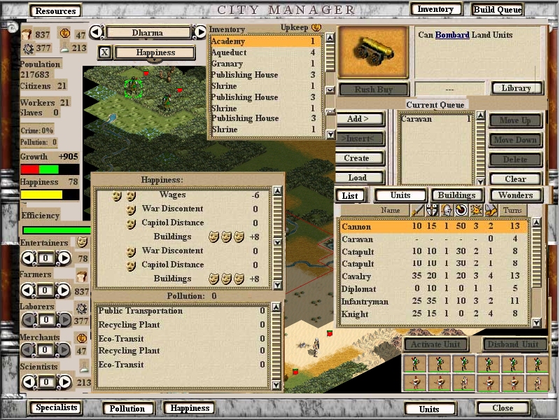
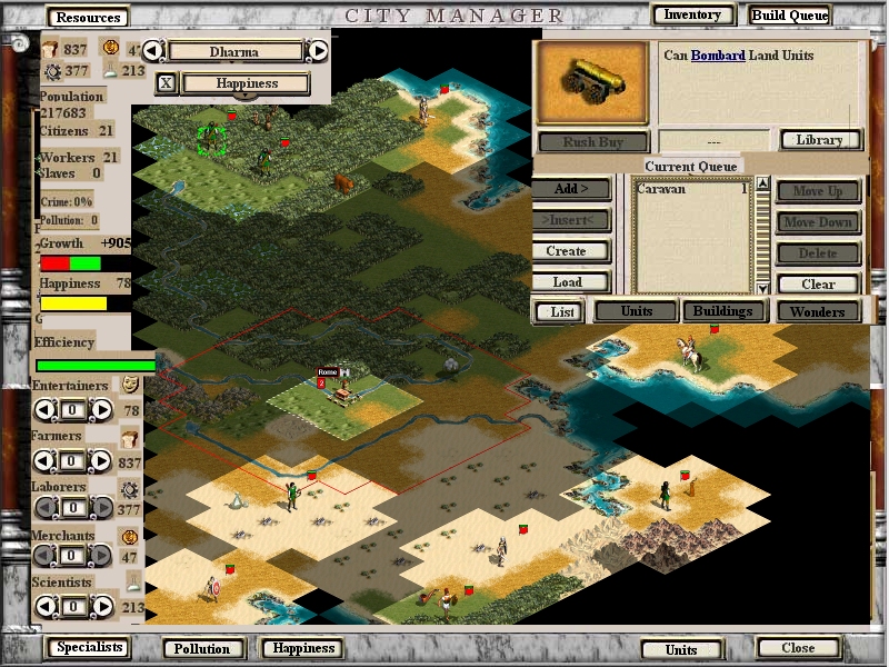
How about this? (See attachments)

You can click on the buttons in the top and bottom of the screen (as well as 'List' in the Current Queue button section for the Buildable Items list) to display/hide various sections of the UI.

This works on all resolutions: on 800x600 most of the map would be invisible if everything is open and you'll have to select which sections you want to see, while on bigger resolutions you could have everything open and still have a decent amount of space to view the world map.

Note that everything but the city name/mayor/eyepointer (which I forgot to add but should be easy enough to fit in) section can be hidden, since I can't imagine anyone would want to hide that section. Of course, it should be easy enough to add a hide button for that section as well, if deemed necessary.


Example 1

Attachment: cityscreen5.jpg
This has been downloaded 44 time(s).

Locutus is offline Locutus
ACS CTP1/2 Manager & Civ4 Co-Manager
Hengelo, The Netherlands
Nov 1999
time: 06:34
  Old Post 21-04-2004 18:48 Visit Locutus<br><img src=/forums/images/staff-icon.gif>'s homepage!
Edit/Delete Message Reply w/Quote
#224 Report this post to a moderator
Browse Apolyton AD-FREE

Example 2

Attachment: cityscreen6.jpg
This has been downloaded 43 time(s).

Gilgamensch is offline Gilgamensch
King
France
Jun 2002
time: 06:34
  Old Post 21-04-2004 18:59
Edit/Delete Message Reply w/Quote
#225 Report this post to a moderator
Get a bigger avatar today!

Looks a bit messy, my first impression. But I will give it more thoughts.

Solver is offline Solver
Apolyton Duke Of Something
Latvia, Riga
Sep 2000
time: 07:34
  Old Post 21-04-2004 19:01 Visit Solver<br><img src=/forums/images/staff-icon.gif>'s homepage!
Edit/Delete Message Reply w/Quote
#226 Report this post to a moderator
Avatar Enlargement: We've got the solution

Good idea Locutus, especially if it would remember the buttons you had clicked the last time. My main desire about the city management screen stays the same - no need to press any extra buttons to build anything - if possible, I want to open the city view, and immediately see my build queue.

Maquiladora is offline Maquiladora
Emperor

Jun 2001
time: 05:34
  Old Post 21-04-2004 19:08 Visit Maquiladora's homepage!
Edit/Delete Message Reply w/Quote
#227 Report this post to a moderator
Support Apolyton, buy Civilization III: Complete

Its definately getting there. One thing im worried about with this is squeezing everything in wouldnt leave space for any new things that might be needed, like trade overview in a city, maybe. You can add another few buttons down the bottom there, i suppose, but it would obviously overlap something, with all menus open.

Locutus is offline Locutus
ACS CTP1/2 Manager & Civ4 Co-Manager
Hengelo, The Netherlands
Nov 1999
time: 06:34
  Old Post 21-04-2004 19:14 Visit Locutus<br><img src=/forums/images/staff-icon.gif>'s homepage!
Edit/Delete Message Reply w/Quote
#228 Report this post to a moderator
Enter the AD-FREE zone

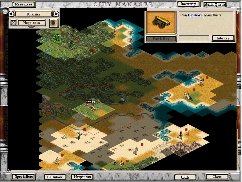
I just realized it might be useful to keep the GL info on the last clicked/currently constructed always open as well, so the most essential info on your city would still be visible even if you've hidden all panels.

Here's what a minimal display would look like (eyepointer to centre on city now also added).

Attachment: cityscreen7.jpg
This has been downloaded 43 time(s).

OnePresent is offline OnePresent
Chieftain
NC USA
Jan 2001
time: 00:34
  Old Post 21-04-2004 19:19
Edit/Delete Message Reply w/Quote
#229 Report this post to a moderator
Support Apolyton buy from Amazon

My concern with this locutus is we have as many buttons to press here as with the current game, no advantage gained on that front. Also the map viewing area is an awkward shape.

I still like my windowshade idea best, but of course I'd like my ideas best. Clean, simple, everything at your fingertips, and just one button for city view.

I'm about ready to give up here. Too much info, too small a space. Maybe 2 city screens versions is best. High res (1280+) and low res (800 and 1024).

Locutus is offline Locutus
ACS CTP1/2 Manager & Civ4 Co-Manager
Hengelo, The Netherlands
Nov 1999
time: 06:34
  Old Post 21-04-2004 19:28 Visit Locutus<br><img src=/forums/images/staff-icon.gif>'s homepage!
Edit/Delete Message Reply w/Quote
#230 Report this post to a moderator
Avatar Enlargement: We've got the solution

quote:
Originally posted by Solver
Good idea Locutus, especially if it would remember the buttons you had clicked the last time.


Indeed, there should probably be several functions to manage the panels: it would be nice if users could define a few standard views that could be toggled between with a single mouse click and/or key combo, and it would be good to have an option to either use a default view or restore the last used settings when opening the city screen. I'm guessing different people would have different preferences here, so it would be good to cater both.

quote:
Originally posted by Maquiladora
One thing im worried about with this is squeezing everything in wouldnt leave space for any new things that might be needed, like trade overview in a city, maybe. You can add another few buttons down the bottom there, i suppose, but it would obviously overlap something, with all menus open.


I'm very much aware of that and I think it will work fine like this. I already designed my latest version with this in mind: most existing panels have some room to expand with more info and there's still some room for new panels, though not too much. The last is inevitable: there's only so much you stuff can squeeze in on a 800x600 screen -- if you continue to add more stuff, eventually you'll have to resort to tabbing anyway, in which case the current setup still works nicely. Optimizing the design to reduce overlap as much as possible is a brigde we can only cross once we get there...

Gilgamensch is offline Gilgamensch
King
France
Jun 2002
time: 06:34
  Old Post 21-04-2004 19:38
Edit/Delete Message Reply w/Quote
#231 Report this post to a moderator
Increase Your PM Length

I think at the end, we will just have to playtest it and decide then further. Screen shots are nice, but you always have to feel it before you can decide..

Locutus is offline Locutus
ACS CTP1/2 Manager & Civ4 Co-Manager
Hengelo, The Netherlands
Nov 1999
time: 06:34
  Old Post 21-04-2004 19:56 Visit Locutus<br><img src=/forums/images/staff-icon.gif>'s homepage!
Edit/Delete Message Reply w/Quote
#232 Report this post to a moderator
Avatar Enlargement: We've got the solution

quote:
Originally posted by OnePresent
My concern with this locutus is we have as many buttons to press here as with the current game, no advantage gained on that front. Also the map viewing area is an awkward shape.


The management functions I mentioned in my last post will prevent problems there. Usually one would only interested in 1 or 2 different views (though different people will have different preferences about what exactly should be in those views), so if one could quickly switch between those there's really no problem.

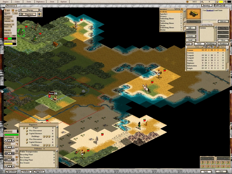
The shape of the main map view area is only awkward on 800x600, which is really too small to display so much information AND a world map anyway. If you're stuck on that resolution, you'll just have to make some choices on what you want to see and what you want to miss. On larger resolutions there isn't much of an issue, see below for how my latest design works out on 1600x1200 with everything opened.

It actually leaves so much space in the middle it might actually be wise to move some things (e.g. Resources and Units panels to the bottom left, City Name panel to the upper right).

Attachment: cityscreen_huge_sm.jpg
This has been downloaded 41 time(s).

Locutus is offline Locutus
ACS CTP1/2 Manager & Civ4 Co-Manager
Hengelo, The Netherlands
Nov 1999
time: 06:34
  Old Post 21-04-2004 20:12 Visit Locutus<br><img src=/forums/images/staff-icon.gif>'s homepage!
Edit/Delete Message Reply w/Quote
#233 Report this post to a moderator
Avatar Enlargement: We've got the solution

quote:
Originally posted by Gilgamensch
I think at the end, we will just have to playtest it and decide then further. Screen shots are nice, but you always have to feel it before you can decide..


It will probably take a conderable amount of time to code even one version of the UI, let alone several (especially if they're very different in setup; e.g. panels vs tabs vs windowshade). We really want to nail down the basic concept as much as possible (if at all) before we start implementing. Details like the exact location and look of various elements can be changed after testing quite easily, but a complete redesign would take a lot of time that could be much better spent.

Maquiladora is offline Maquiladora
Emperor

Jun 2001
time: 05:34
  Old Post 21-04-2004 20:44 Visit Maquiladora's homepage!
Edit/Delete Message Reply w/Quote
#234 Report this post to a moderator
Help yourself to an AD-FREE life

Then wouldnt it just be better to develop the big ideas (strategic resources, new trade system etc) into the game first, before making a new (slightly inflexible) UI?

J Bytheway is offline J Bytheway
Emperor
England
Jul 2001
time: 05:34
  Old Post 21-04-2004 20:49 Visit J Bytheway's homepage!
Edit/Delete Message Reply w/Quote
#235 Report this post to a moderator
Support Apolyton, buy Civilization III: Complete

I think that I generally like this latest idea, but (as you say) it might be nice if things changed a bit on higer resolutions so that the screen wasn't quite so spread about.

Solver is offline Solver
Apolyton Duke Of Something
Latvia, Riga
Sep 2000
time: 07:34
  Old Post 21-04-2004 20:55 Visit Solver<br><img src=/forums/images/staff-icon.gif>'s homepage!
Edit/Delete Message Reply w/Quote
#236 Report this post to a moderator
Browse Apolyton AD-FREE

Yeah, the latest idea seems quite fine. What do you people think are the less needed pieces of info, that could be hidden from 800x600 unless toggled by a tab?

J Bytheway is offline J Bytheway
Emperor
England
Jul 2001
time: 05:34
  Old Post 21-04-2004 20:59 Visit J Bytheway's homepage!
Edit/Delete Message Reply w/Quote
#237 Report this post to a moderator
Tired of ads?

quote:
Originally posted by Solver
Yeah, the latest idea seems quite fine. What do you people think are the less needed pieces of info, that could be hidden from 800x600 unless toggled by a tab?


I think of those sections I would generally hide pollution, happiness and inventory.

Solver is offline Solver
Apolyton Duke Of Something
Latvia, Riga
Sep 2000
time: 07:34
  Old Post 21-04-2004 21:13 Visit Solver<br><img src=/forums/images/staff-icon.gif>'s homepage!
Edit/Delete Message Reply w/Quote
#238 Report this post to a moderator
Support Apolyton, buy Galactic Civilizations: Deluxe Edition

Good suggestion - a detailed breakup of their happiness reasons isn't that important at all times...

OnePresent is offline OnePresent
Chieftain
NC USA
Jan 2001
time: 00:34
  Old Post 21-04-2004 21:19
Edit/Delete Message Reply w/Quote
#239 Report this post to a moderator
Tired of ads?

quote:
Originally posted by Locutus

The management functions I mentioned in my last post will prevent problems there. Usually one would only interested in 1 or 2 different views (though different people will have different preferences about what exactly should be in those views), so if one could quickly switch between those there's really no problem.


OK, a management function would take care of some of those concerns.

I really think you are doing good concept work here, and I know this stuff takes time. It invites new ideas which is good. But it unfortunately also invites critisism.

I dream of a clean, usuable, logical, nice looking interface. With the city screen functions scattered to the 4 corners of the screen I think that falls short on all accounts. If you have a large resolution screen why not group all these functions into 1 corner. Then everything is at your fingertips. No moving the mouse (and eye) from one corner to the next. How about one complete panel comes up from say the bottom left corner, and it centers the city on the map in the background as it opens.

Solver is offline Solver
Apolyton Duke Of Something
Latvia, Riga
Sep 2000
time: 07:34
  Old Post 21-04-2004 21:24 Visit Solver<br><img src=/forums/images/staff-icon.gif>'s homepage!
Edit/Delete Message Reply w/Quote
#240 Report this post to a moderator
Remove this text

quote:
If only just one idea....

 
Pages (10): [ <<   5   6   7   8   9   10   ]
< Last Thread     Next Thread > Post New Thread     Post A Reply
All times are GMT. The time now is 05:34.
Apolyton Time is 00:34.
    top of page
Rate This Thread:
Forum Jump:
Forum Rules:
You may not post new threads
You may not post replies
You may not post attachments
You may not edit your posts
HTML code is ON
vB code is ON
Smilies are ON
[IMG] code is ON


Contact Us - Apolyton Civilization Site - Support Us!

Building a better Apolyton through better information. Click here and take our poll!
Non-US visitors, click here!

Powered by: vBulletin Version 2.0.3
Copyright ©2000, 2001, Jelsoft Enterprises Limited.

Page generated in 0.0631 seconds (90.34% PHP - 9.66% MySQL) with 36 queries
Page Loading Time:

Support Apolyton: Amazon USA | Amazon UK | Amazon DE | Amazon FR |
Support Apolyton and get FREE PLUS, Buy from Chips&Bits: Galactic Civilizations | Galactic Civilizations: Deluxe Edition | Call to Power 2 | Civilization: The Boardgame | GURPS/ Alpha Centauri | Alpha Centauri | Civilization IV | Civilization III: Complete |


Front Page | Civilization IV | Civilization III | Civilization II | Call to Power II | Alpha Centauri | Master of Orion III
Rise of Nations | Galactic Civilizations | Galactic Civilizations II | Misc
Alt.Civs | Civ I | C:CtP I | About | News | Directory | Apolyton Store | Forums | Chat | Columns | Interviews | Newsletter
Scenario League | CSC | Clash of Civs | Spanish Site | CtP Maps | Cradle of Civ | WesW's Ctp1/2 Site | Civ3 Haven

apolyton.net | apolyton.com | civilization2.net | civilization3.net | civilization4.net | civilizationiv.info | calltopower.net | galciv.net | galciv2.net | moo3.net